Open Cultures
Identity
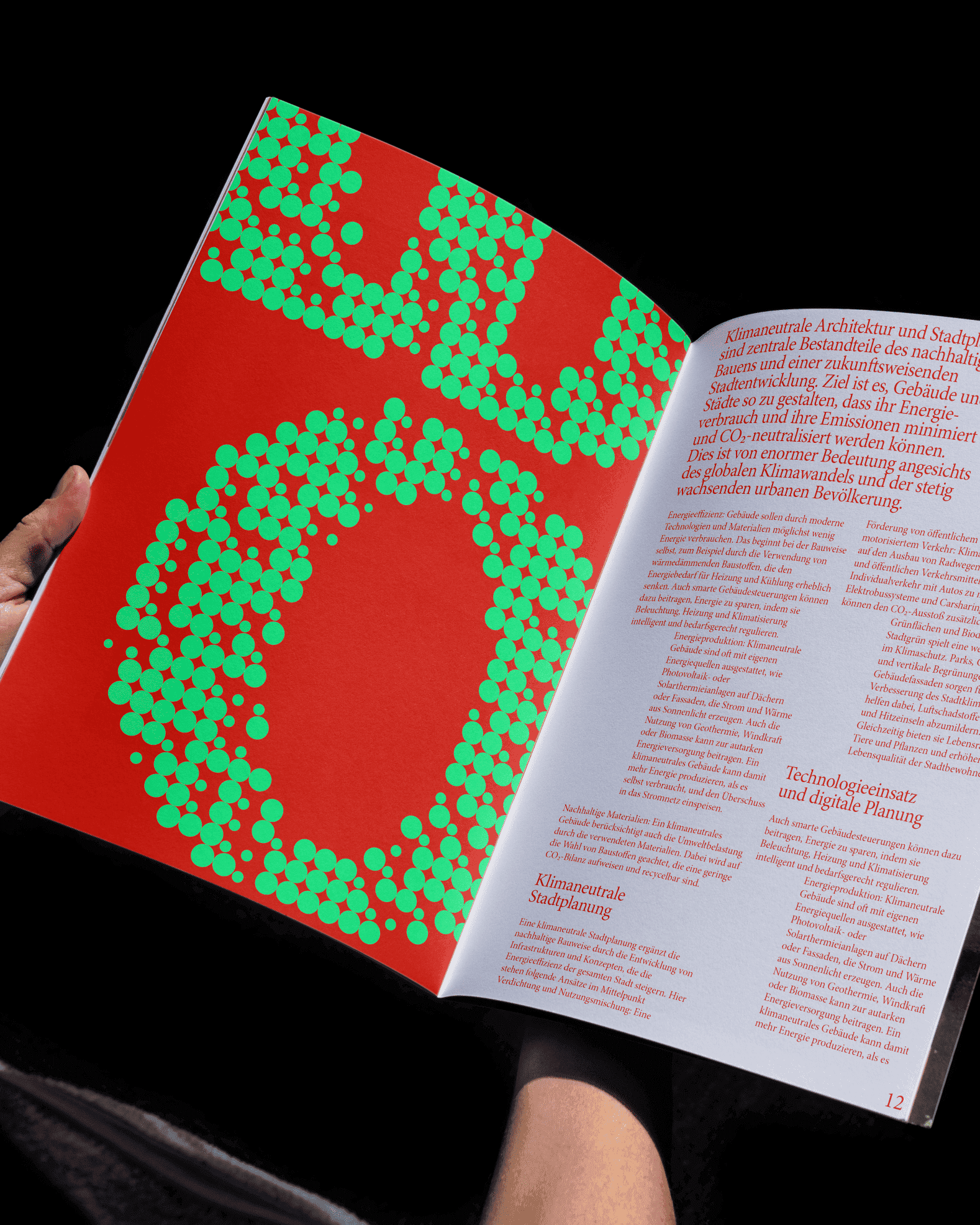
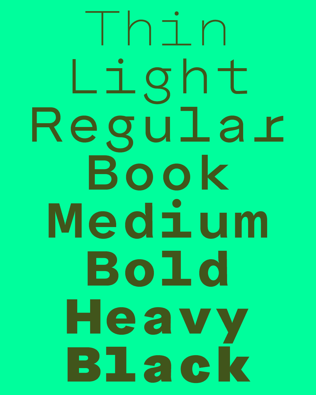
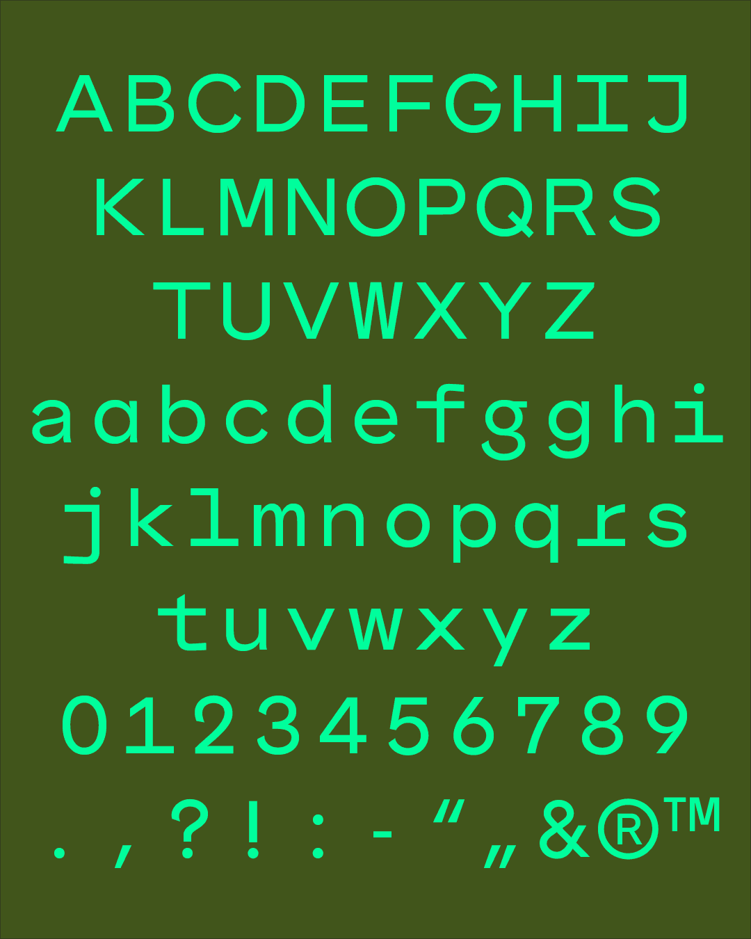
The project Open Planning Cultures seeks to transform climate knowledge into actionable principles for sustainable living, emphasizing climate adaptation in urban development and spatial planning. By bridging the gap between scientific insights and practical application, the project examines the intricate relationship between climate science, urban design, and sustainability through three dedicated sub-labs. The corporate identity of Open Planning Cultures introduces a contemporary visual language that communicates climate knowledge clearly, avoiding clichés and overused aesthetics. At its core is a unique typographical system where text is programmatically rasterized into particle patterns. Each particle represents one of the three sub-labs, and the dynamic process ensures that no word appears the same twice. This ever-evolving, organic aesthetic serves as a visual metaphor for the project's natural and adaptive ethos.
Oct 2024— ongoing
The project is initiated by the GTAS (Institute for the History and Theory of Architecture and the City) at the Technical University Braunschweig, led by Prof. Dr. Tatjana Schneider.
1 / 2
2 / 2
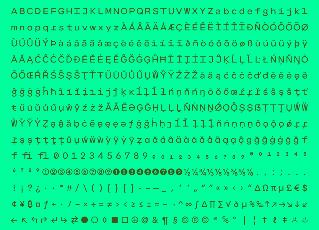
The corporate identity is built around a custom-designed serif typeface, currently unreleased, and programmatically rasterized.
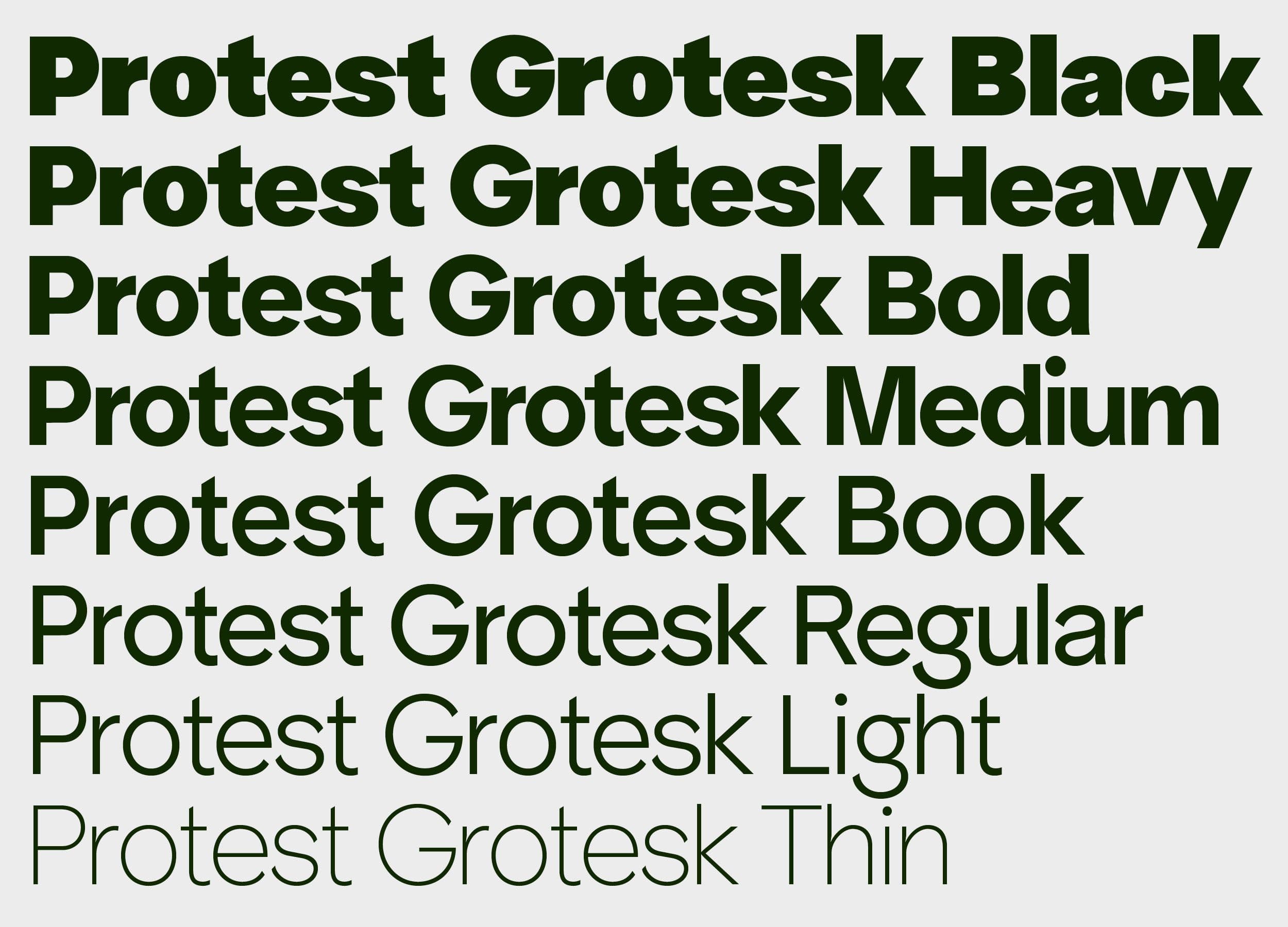
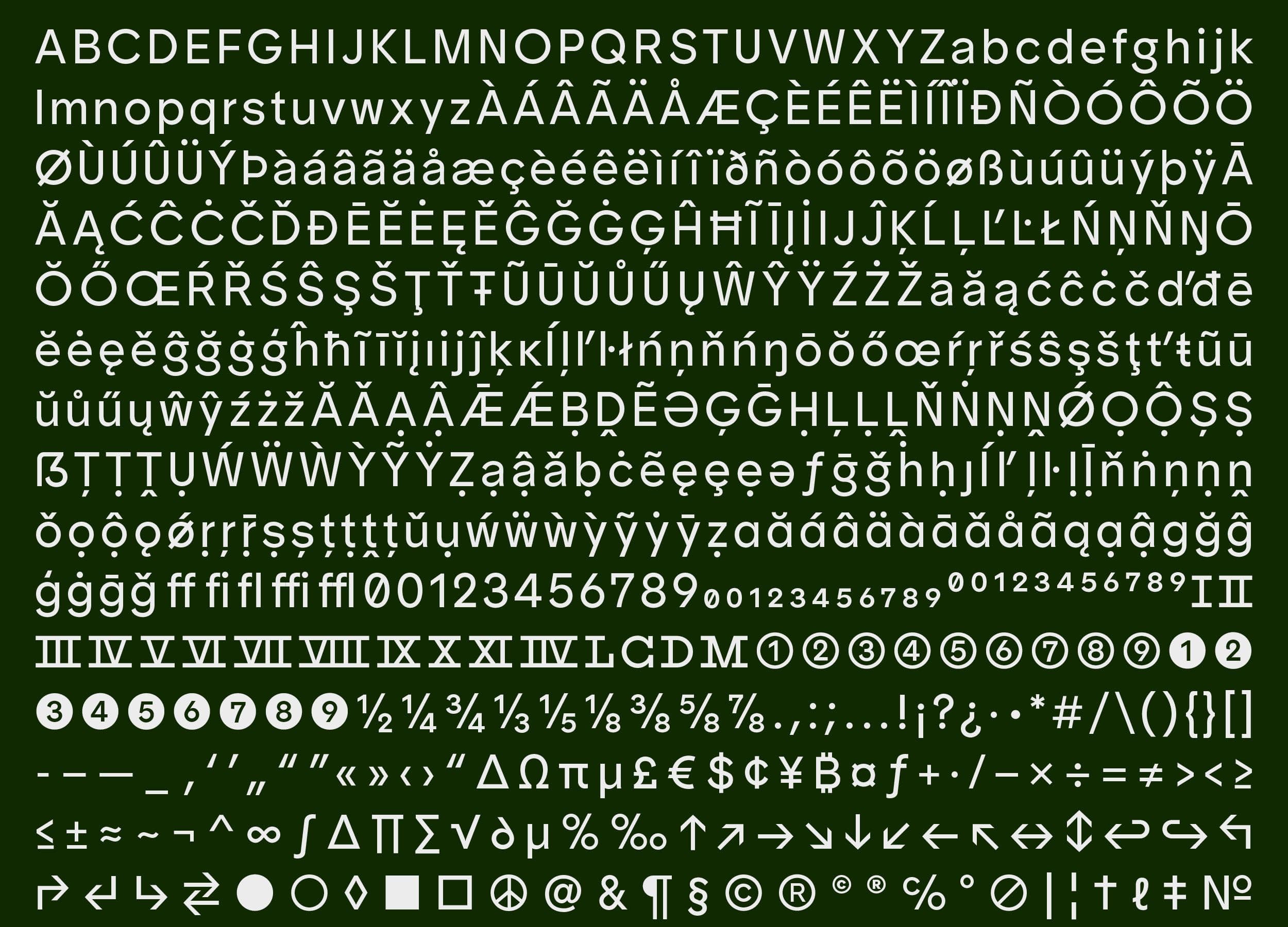
Protest Grotesk
Type Design
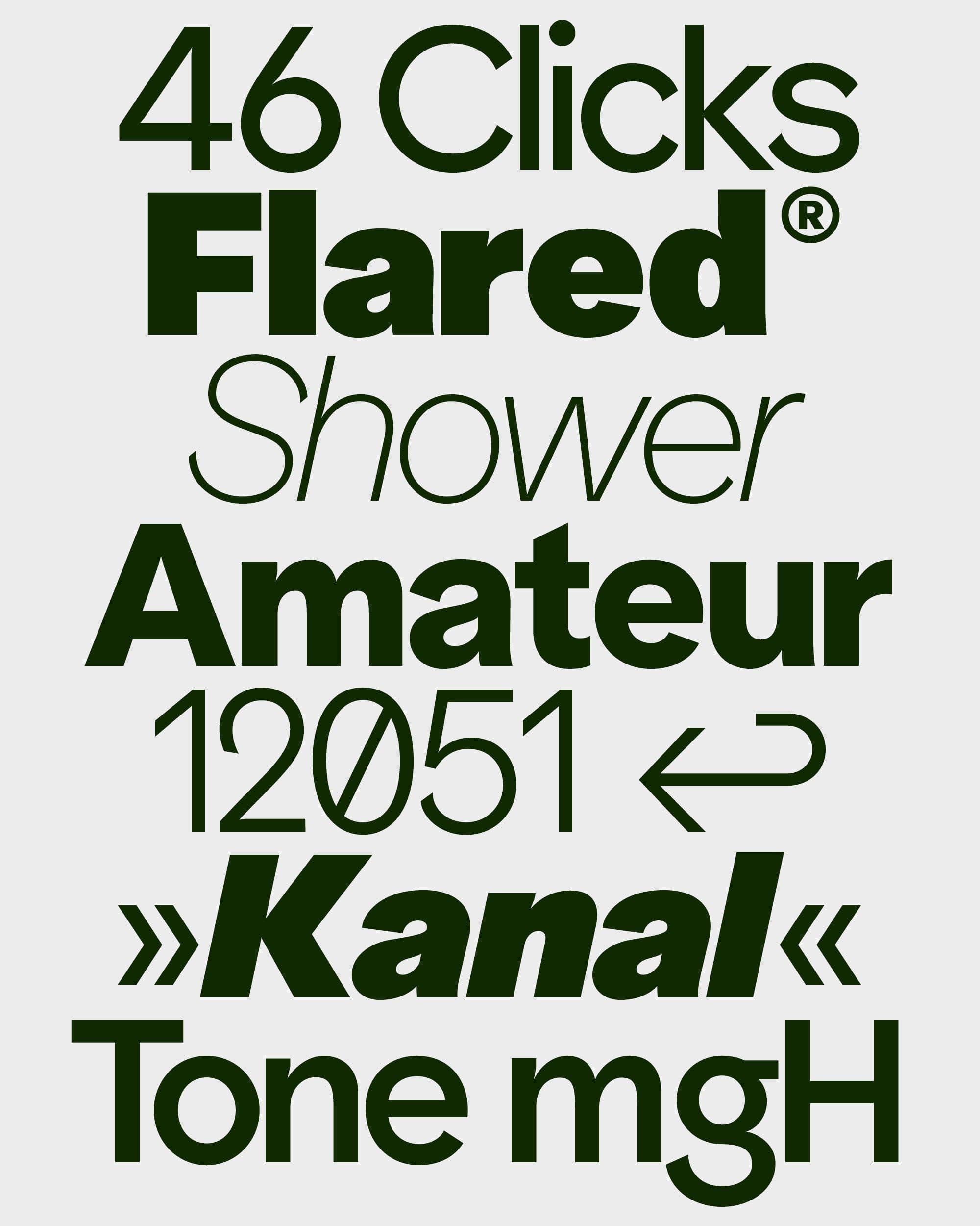
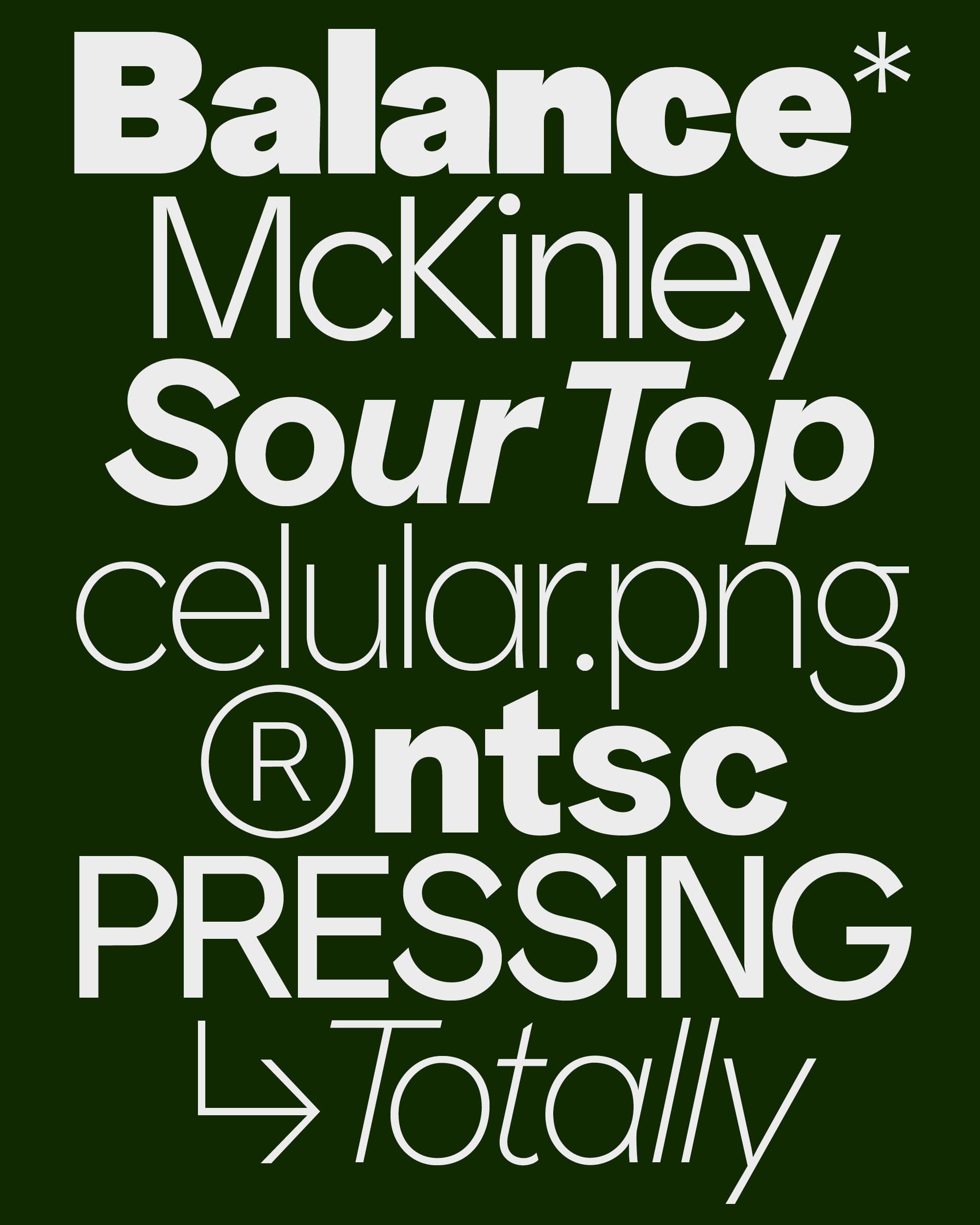
The Protest Grotesk® typeface reinterprets the geometric principles of pre-war German designs to meet the demands of contemporary visual communication. Rooted in the constructivist aesthetics of Futura (Paul Renner, 1928) and Kabel (Rudolf Koch, 1929), Protest Grotesk bridges historical design principles with modern functionality. Its development balances the distinctive features of its geometric lineage with adjustments for legibility and adaptability, making it versatile across contexts—from compact text to bold display settings. At its core, Protest Grotesk embodies the rebellious spirit of the “grotesque” typefaces that challenged the ornamental styles of the 19th century. This ethos of defiance and innovation drives the typeface’s design, which rejects conservatism while embracing precision and utility. Protest Grotesk is positioned at the intersection of historical homage and contemporary functionality, offering a design that bridges past and present.
Aug 2023
For trial downloads and licensing requests please contact us via direct inquiry.
1 / 7
2 / 7
3 / 7
4 / 7
5 / 7
6 / 7
7 / 7
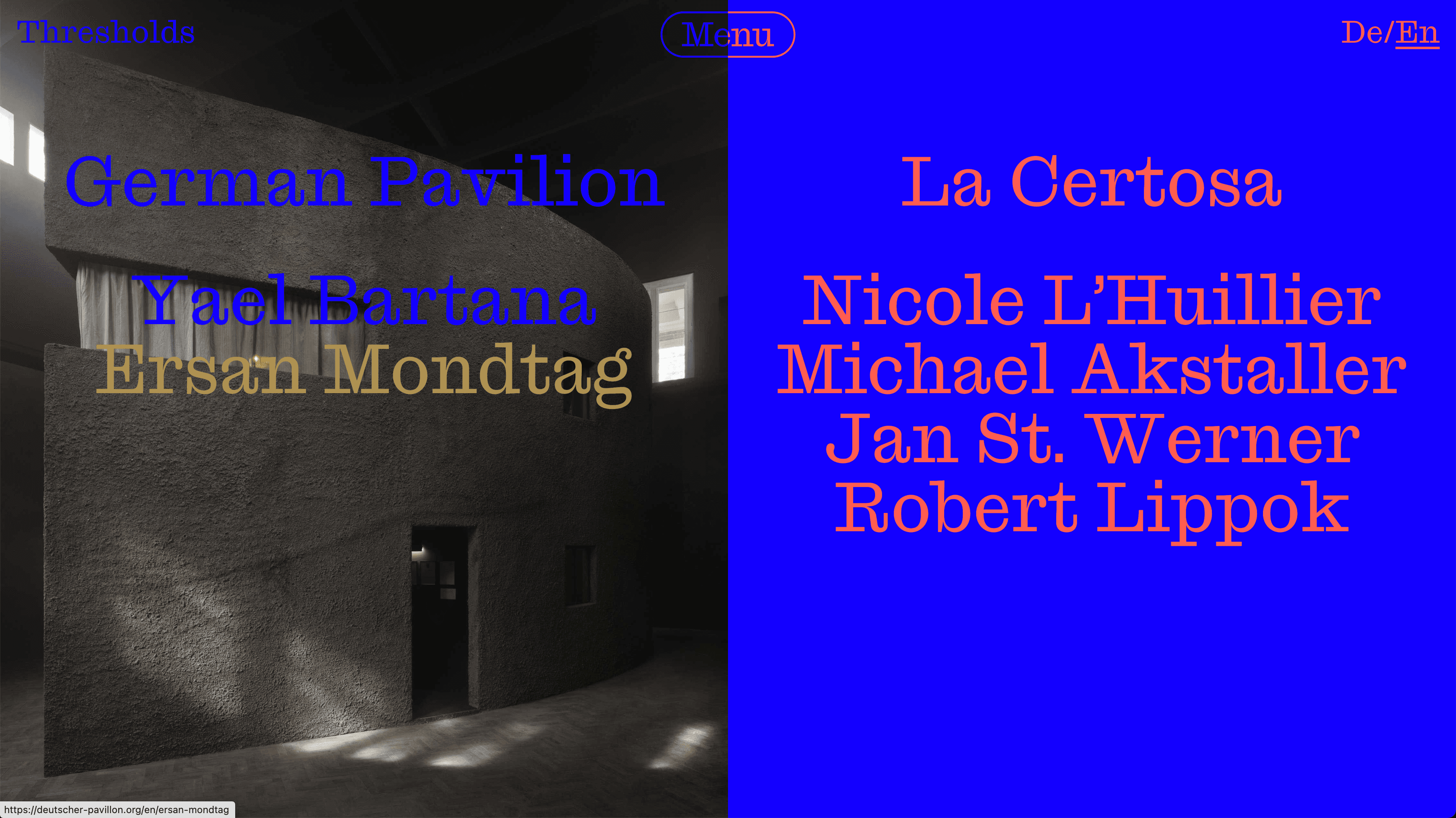
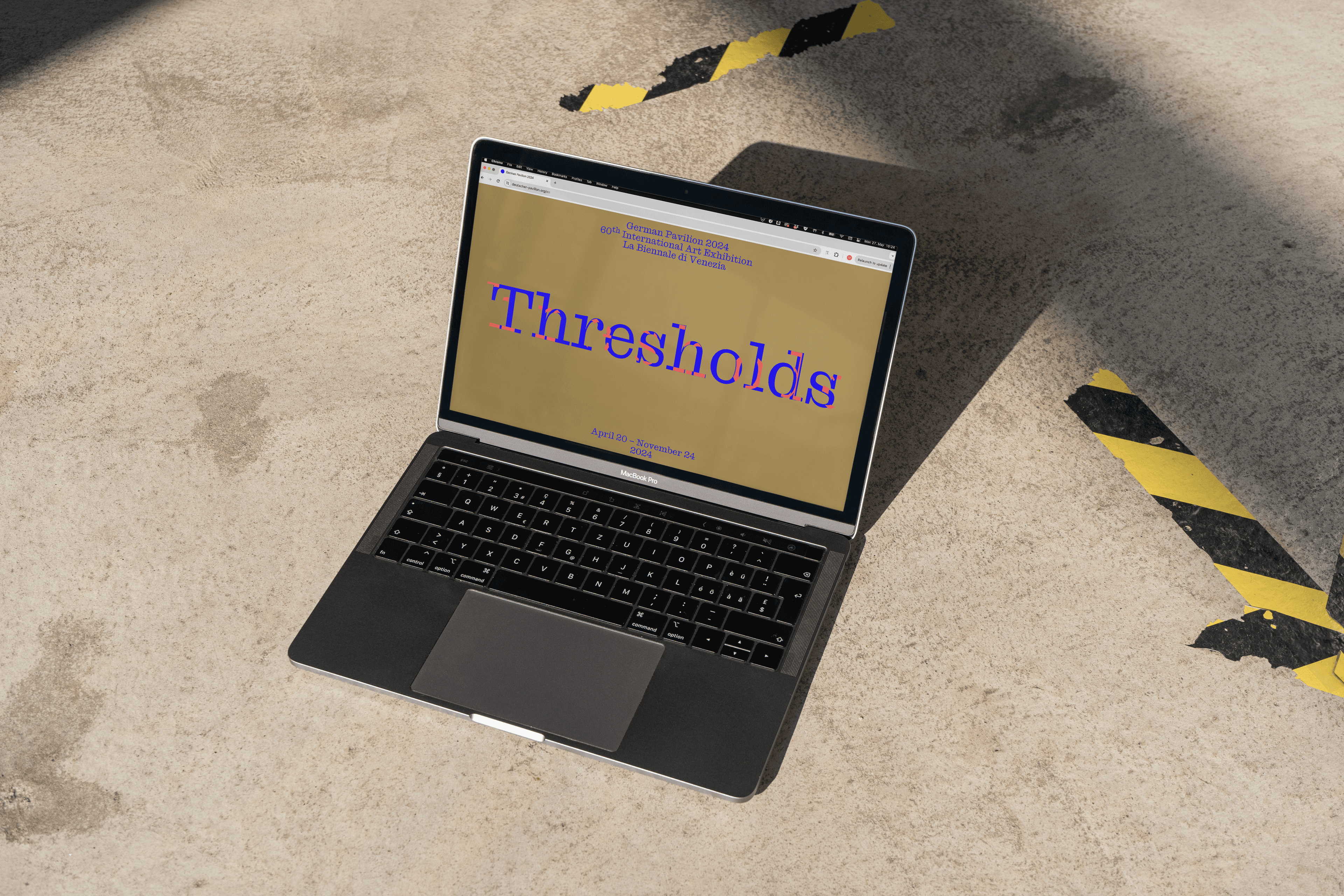
German Pavilion at La Biennale di Venezia 2024
Programming
Development of the website for the German Pavilion at the 60th Venice Biennale. For 2024, the pavilion’s contribution is titled THRESHOLDS and explores themes of history and the future through a variety of artistic perspectives. The exhibition examines moments of transition, transformation, and boundaries, presenting them across three distinct yet interconnected scenarios. These scenarios serve as a narrative framework for the pavilion, allowing visitors to engage with the concepts of crossing and encountering thresholds—whether they be physical, emotional, or conceptual. The visual identity of the pavilion, designed by MatterOf, is intricately aligned with the overarching theme. Central to the identity is a compelling key visual inspired by the concept of a palimpsest—a manuscript page where earlier text has been scraped off or erased to make space for new writing. Despite the erasure, remnants of the original text remain faintly visible, creating a layered and multi-temporal surface. This idea resonates with the pavilion’s exploration of how the past continuously informs the present and the future.
Apr 2024
The visual identity was developed by MatterOf Visual Practices. The German Pavilion was curated by Çağla Ilk and includes contributions from artists Yael Bartana, Ersan Mondtag, Robert Lippok, Nicole L’Huillier, Jan St. Werner, and Michael Akstaller.
1 / 3
3 / 3
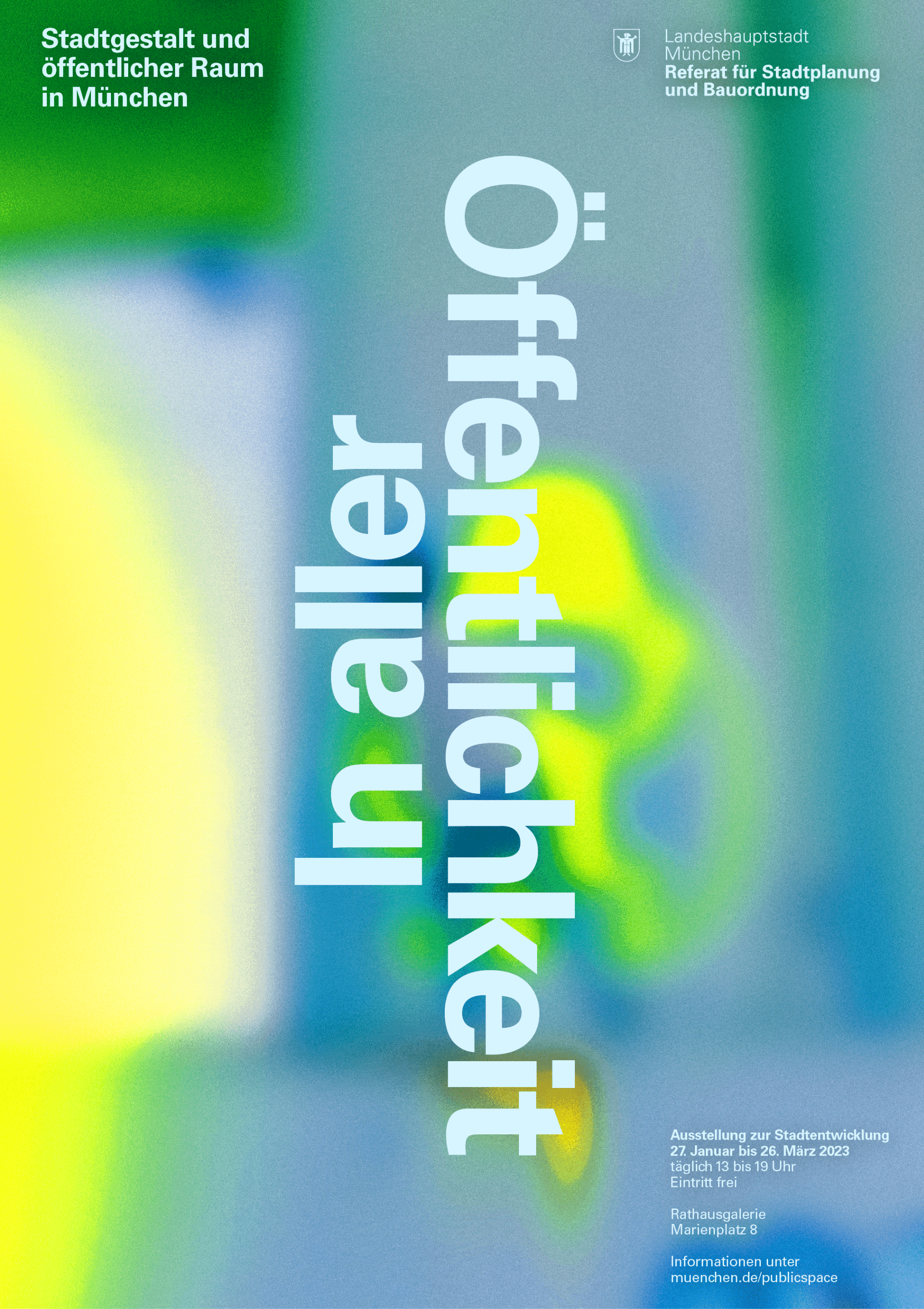
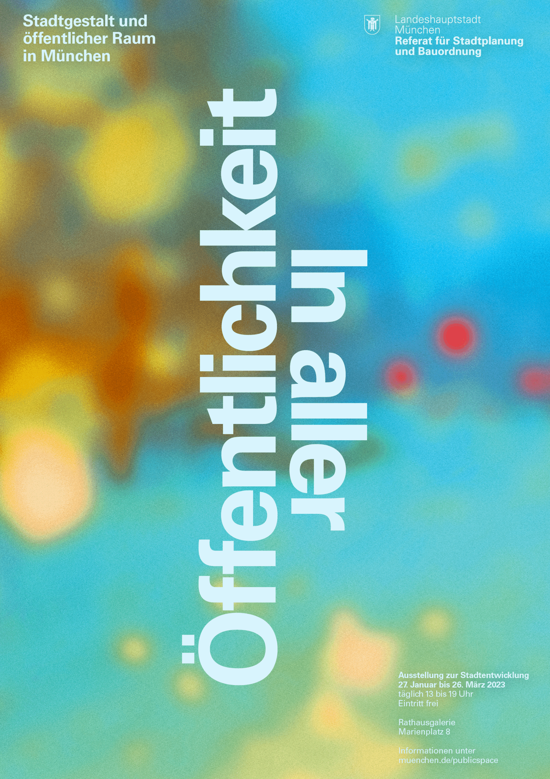
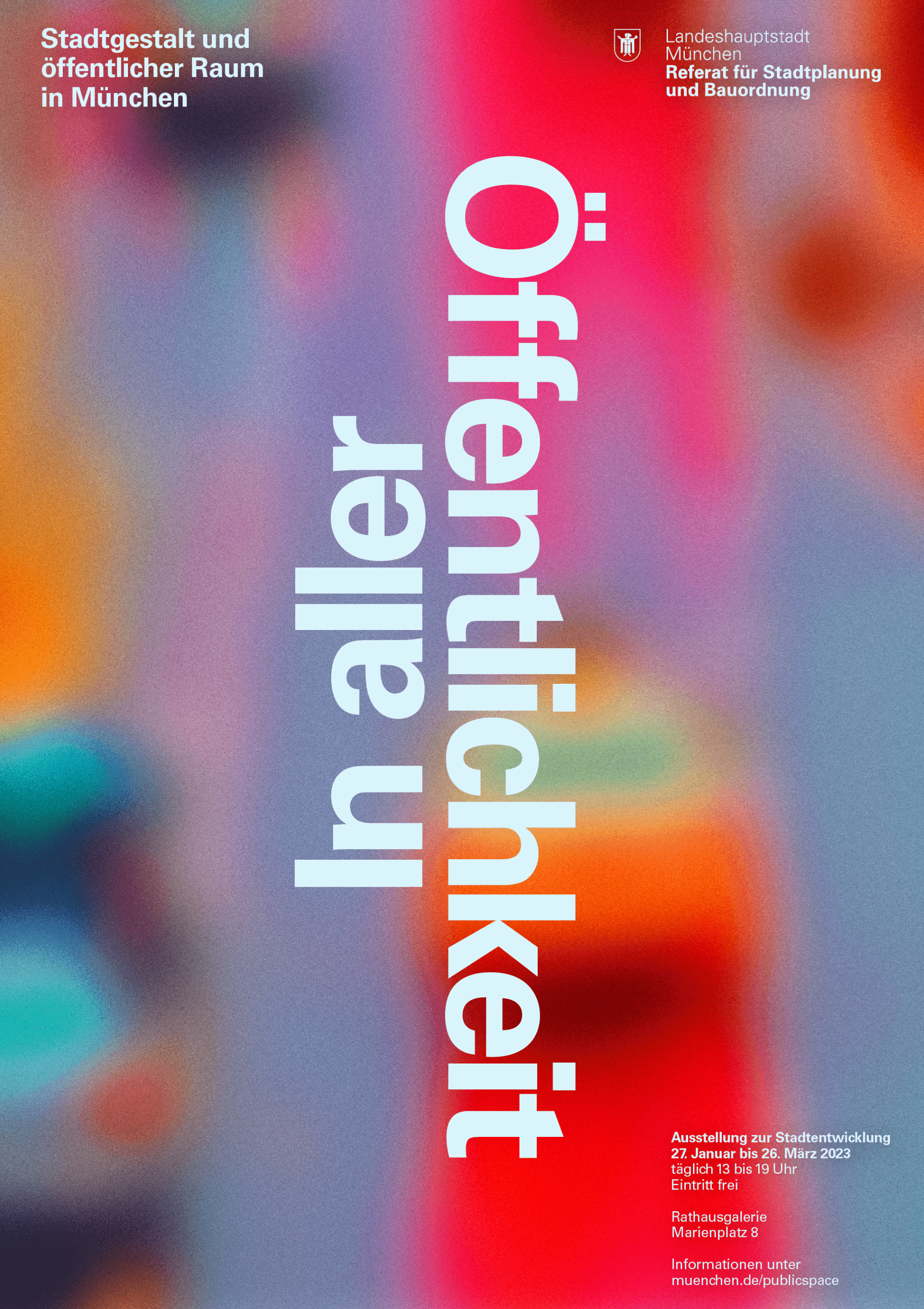
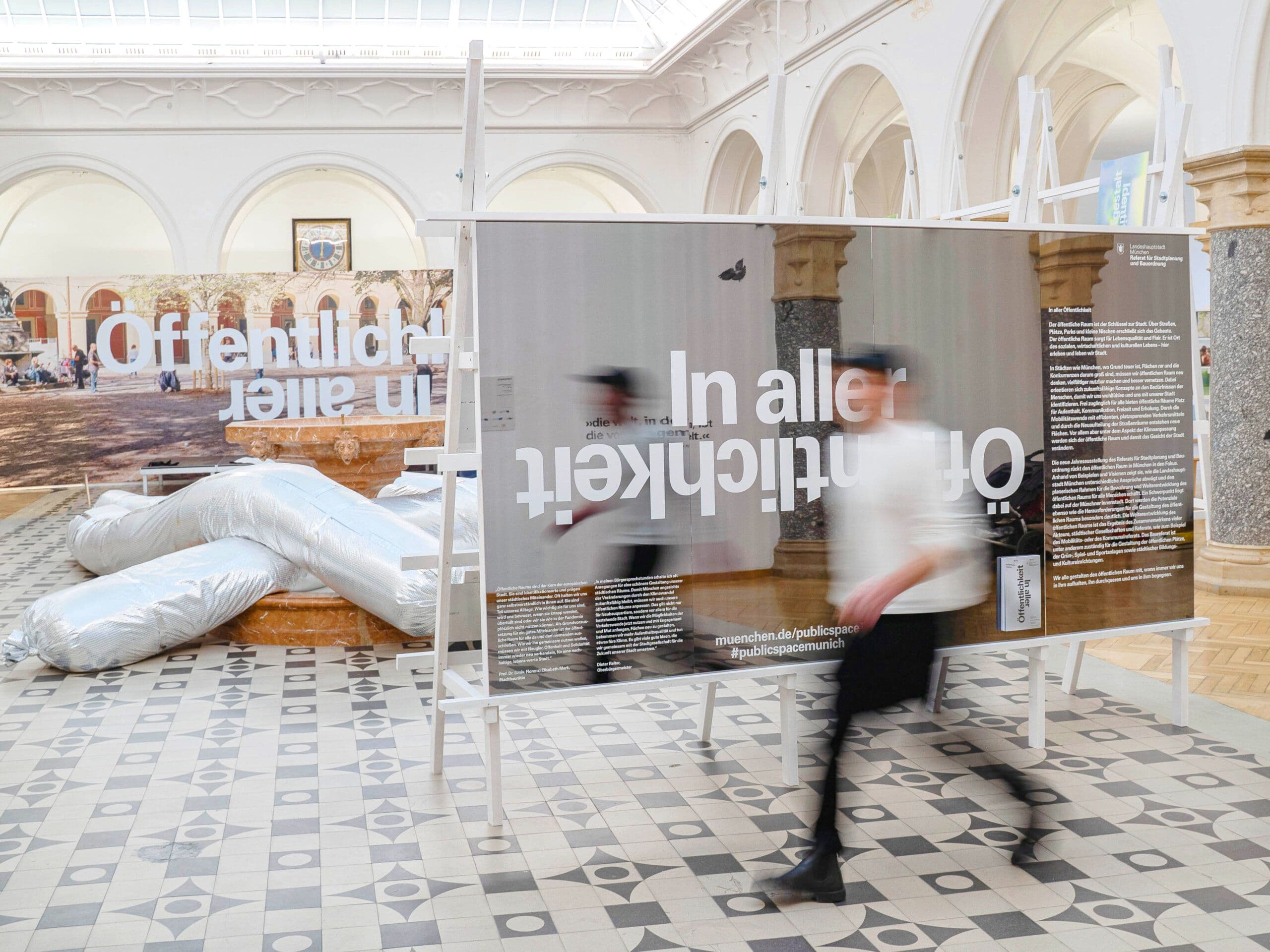
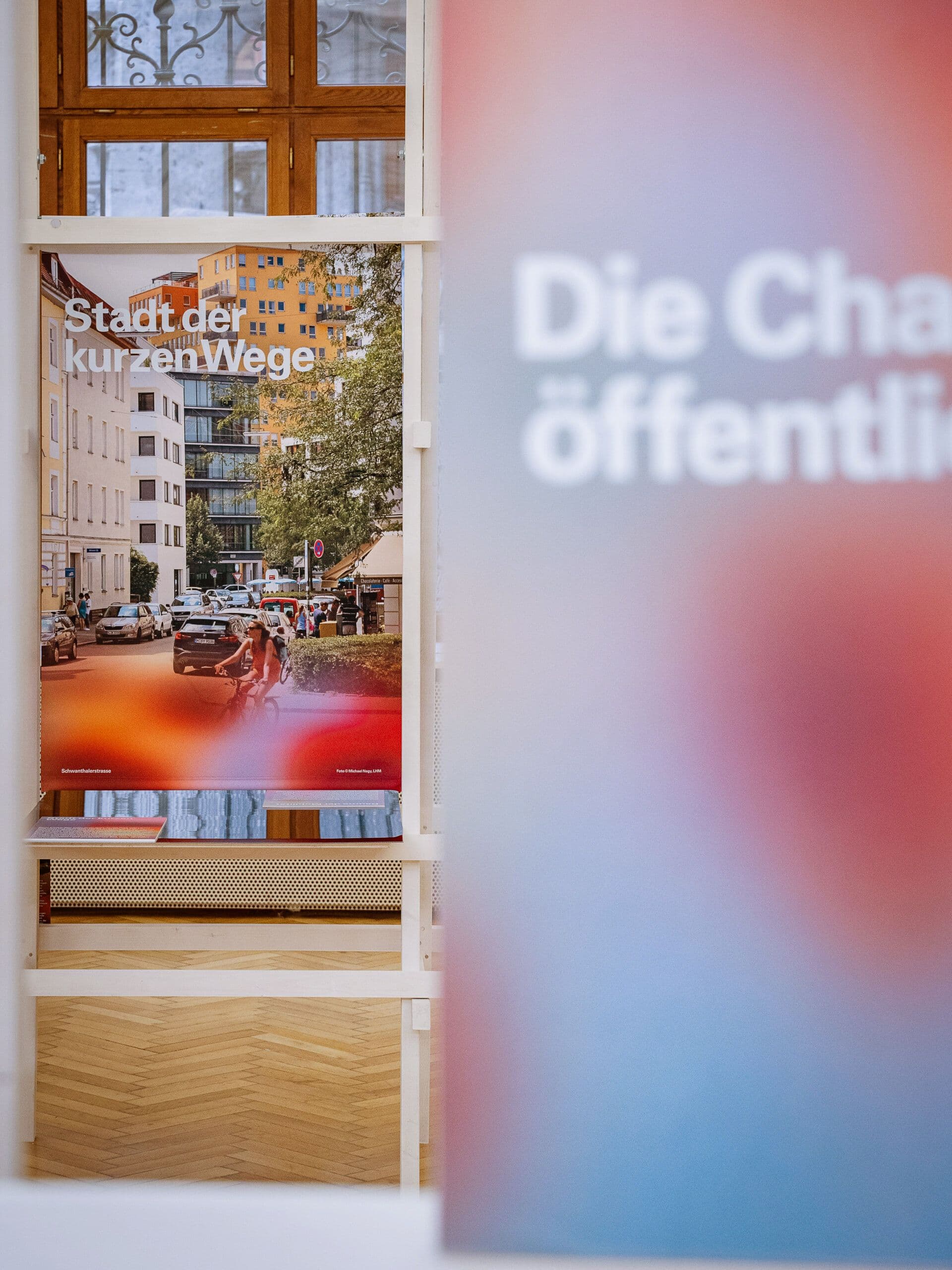
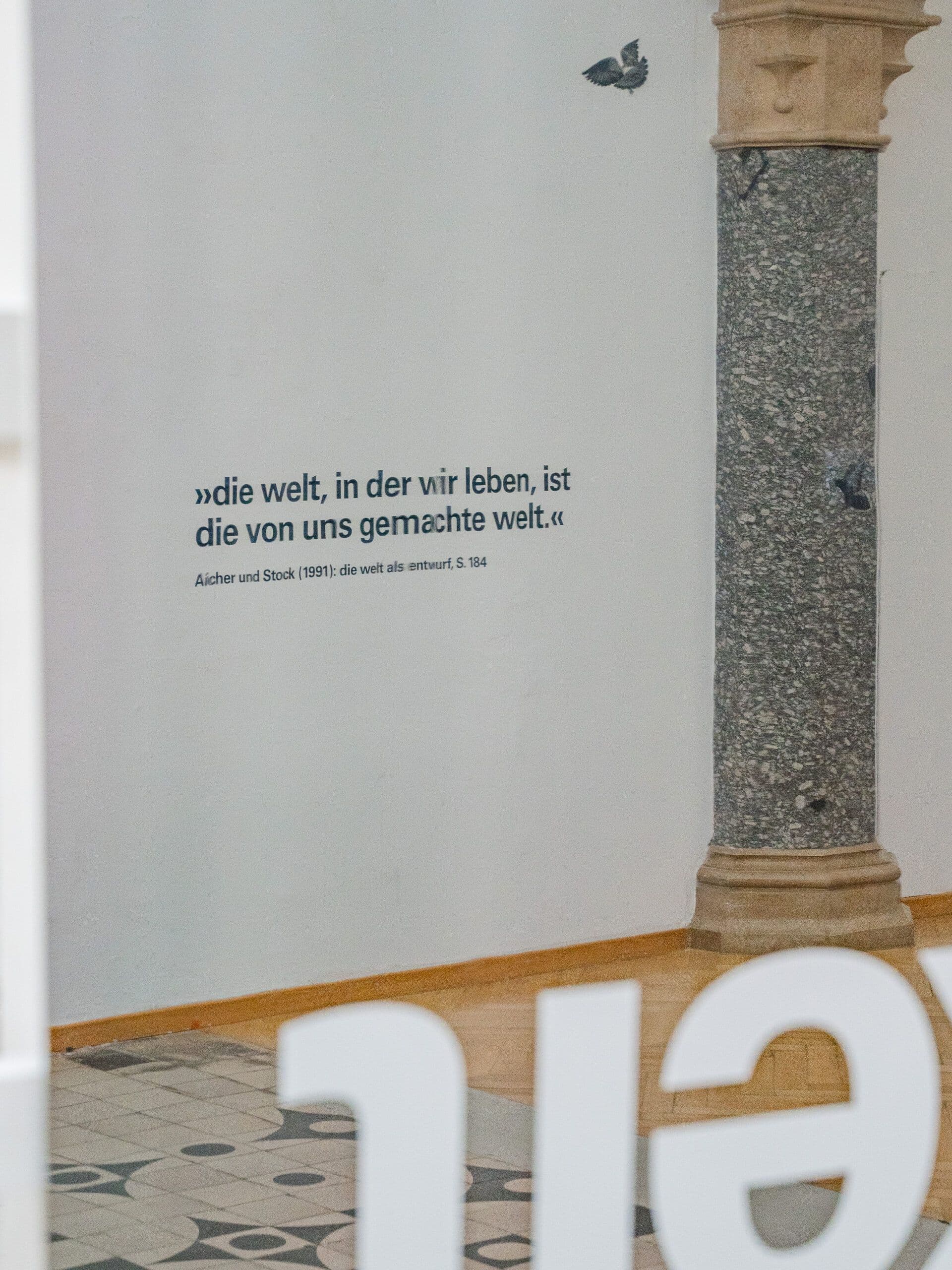
In Aller Öffentlichkeit
Exhibition, Identity
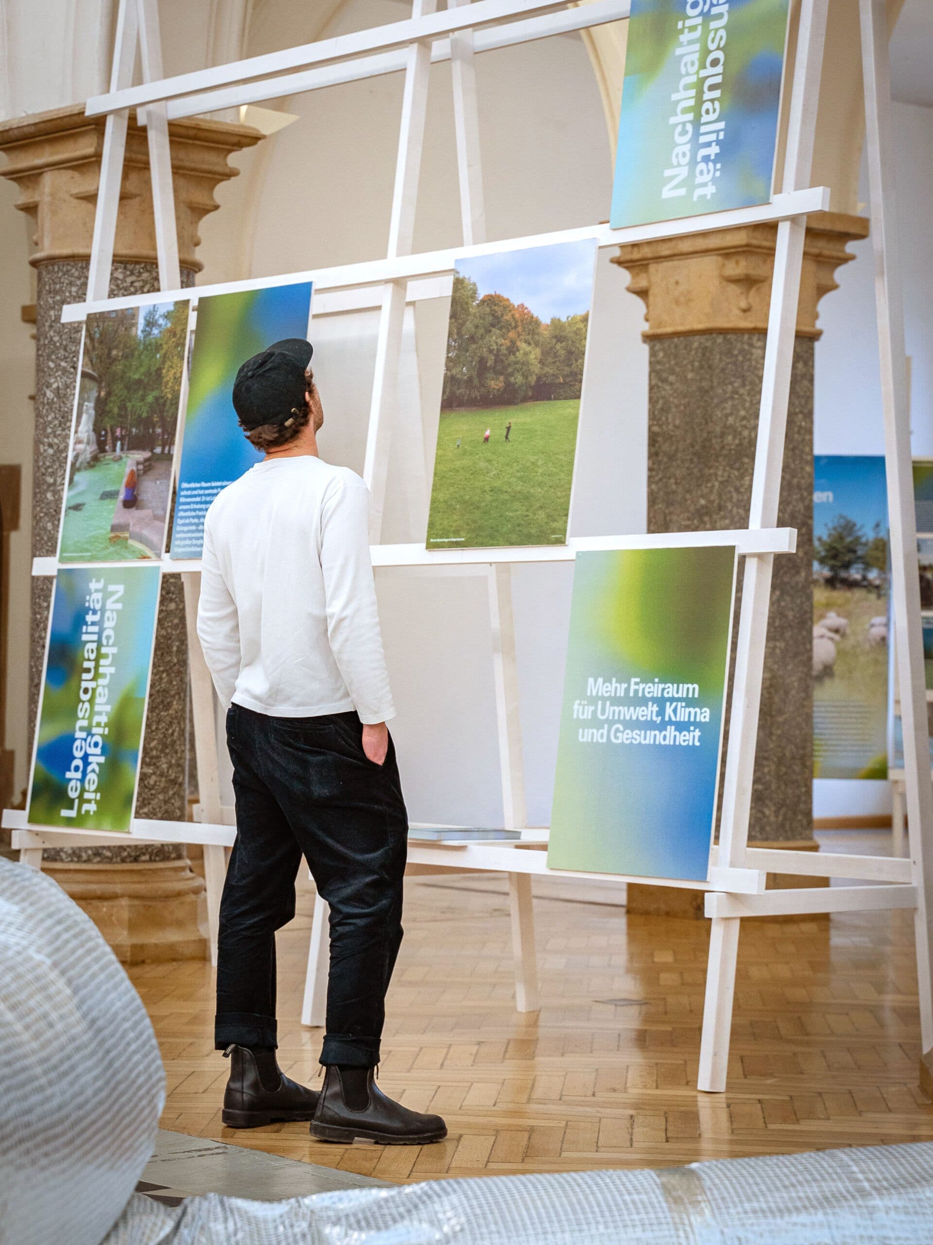
The 2023 annual exhibition for Munich’s Department of Urban Planning and Building Regulations explored public spaces as a reflection of society under the theme "In Aller Öffentlichkeit" ("In Public View"). The exhibition aimed to make Munich's urban spaces visible, accessible, and experiential, emphasizing the ongoing dialogue between diverse users and how they shape these spaces. A central feature was a 15-meter-long reflective seating sculpture around the fountain in the Town Hall Gallery, symbolizing this dialogue. The sculpture’s transformation reflected the varying needs of visitors, raising questions such as "What is public space?", "Who decides its use?", and "What defines Munich’s character?". These questions were explored through the exhibition’s themes, as well as discussions, walks, tours, and a public library in the atrium. The exhibition avoided a strict hierarchy, encouraging visitors to wander and explore. This approach created a personal journey through Munich’s public spaces, raising awareness of everyday urban experiences and fostering a deeper connection to the city.
Jan 2023
The exhibition was designed in cooperation with Sebastian Klawiter and Laura Bruns and was shown between January 27th and March 26th at Rathausgalerie München.
1 / 7
2 / 7
3 / 7
4 / 7
5 / 7
6 / 7
7 / 7
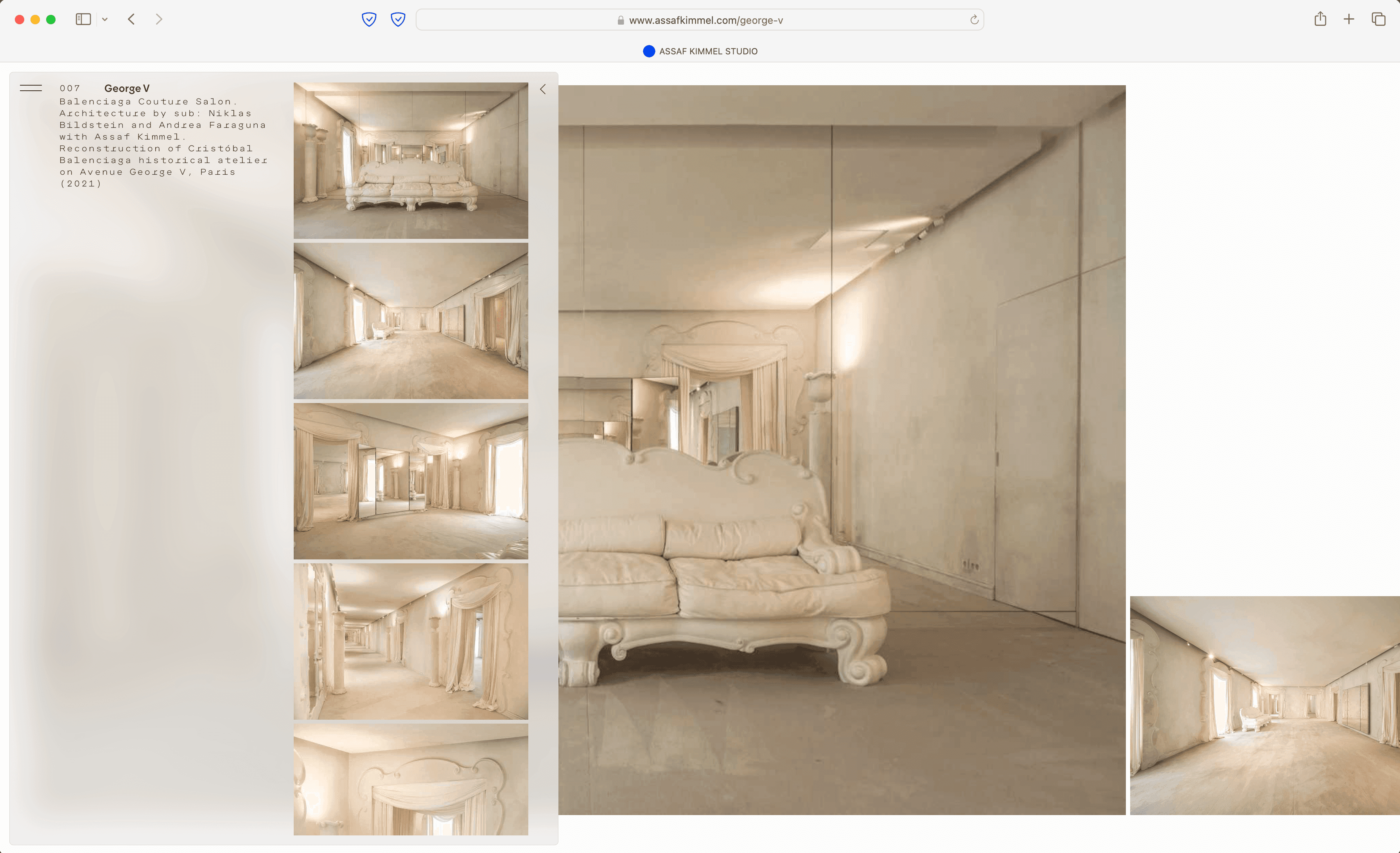
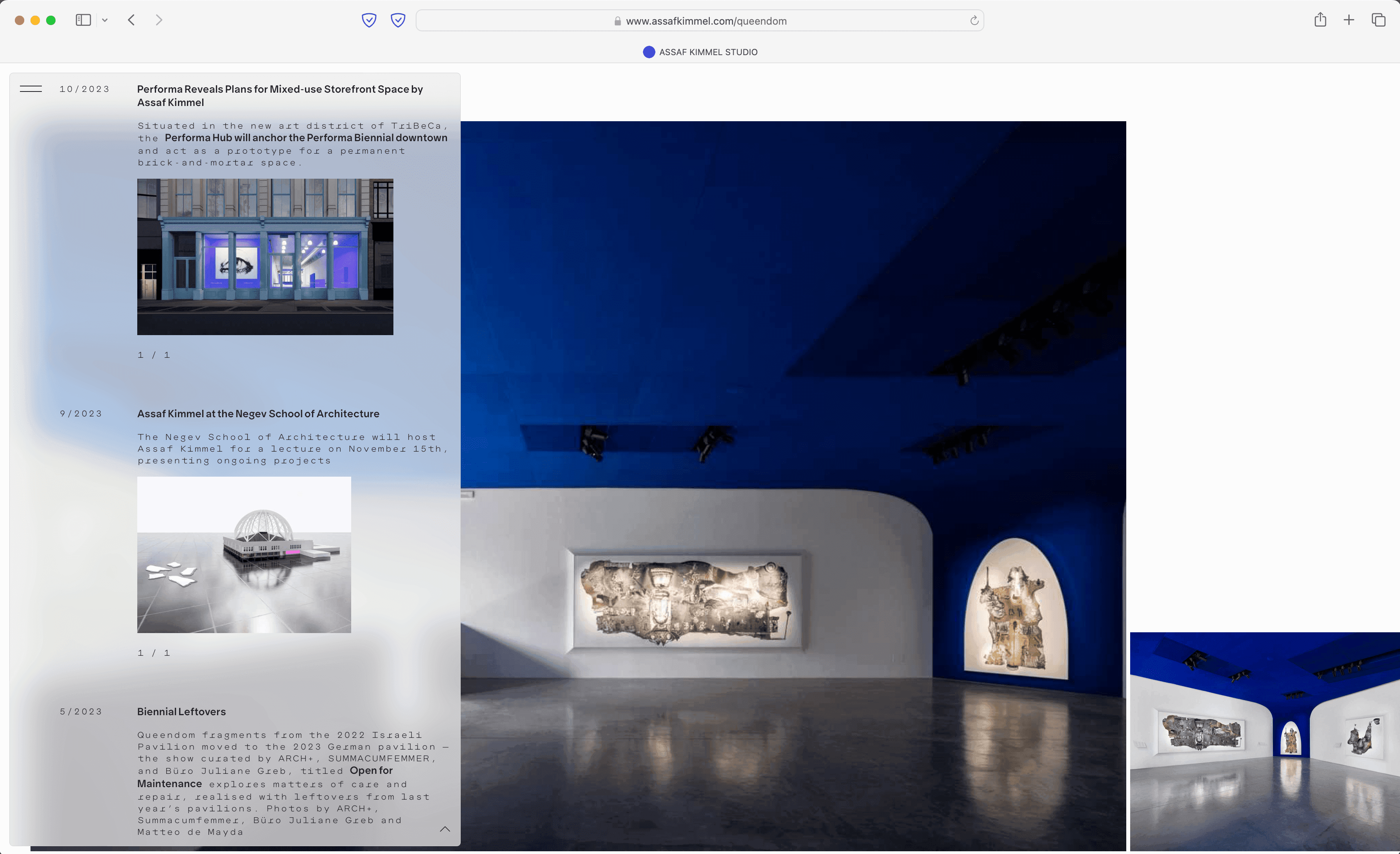
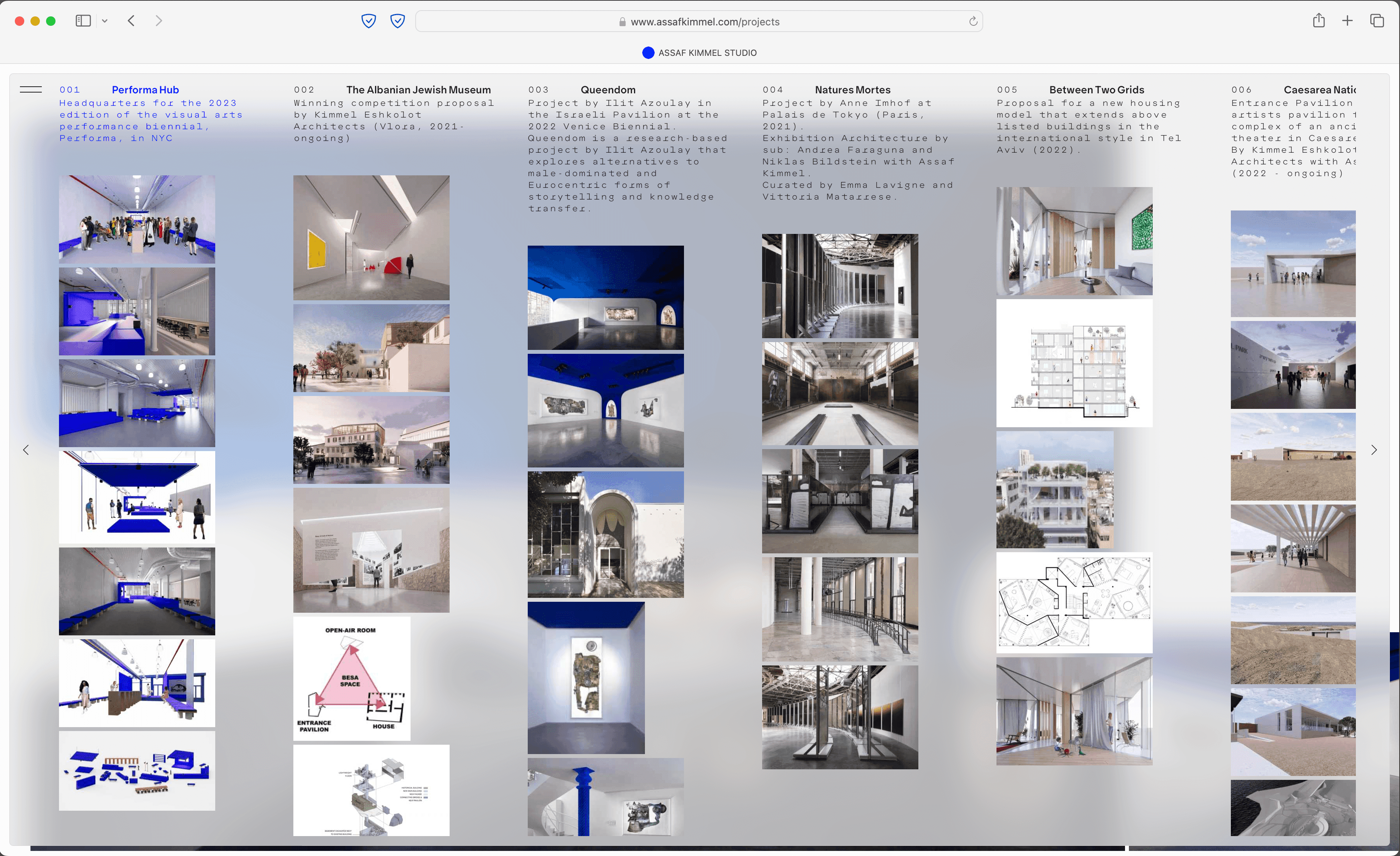
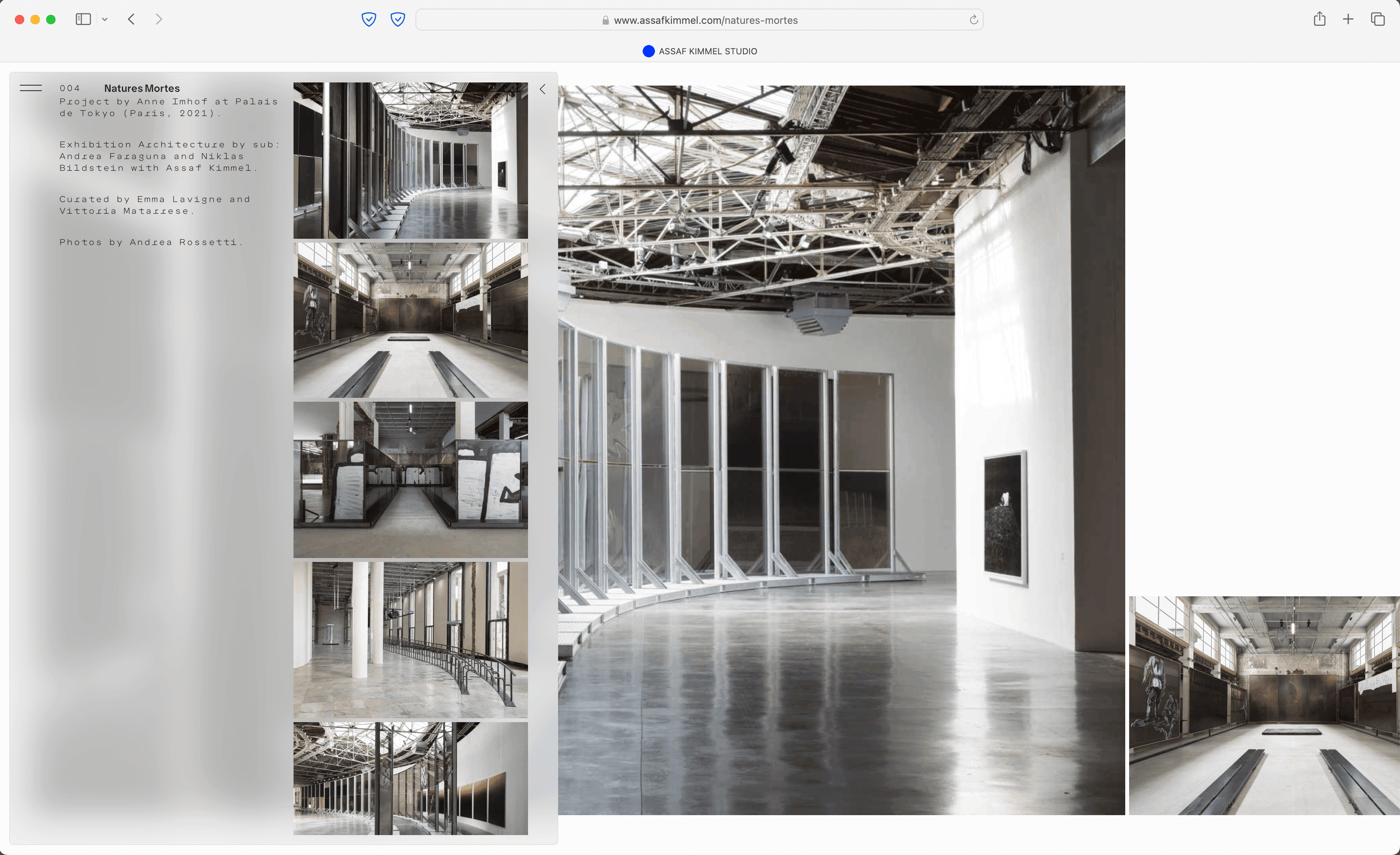
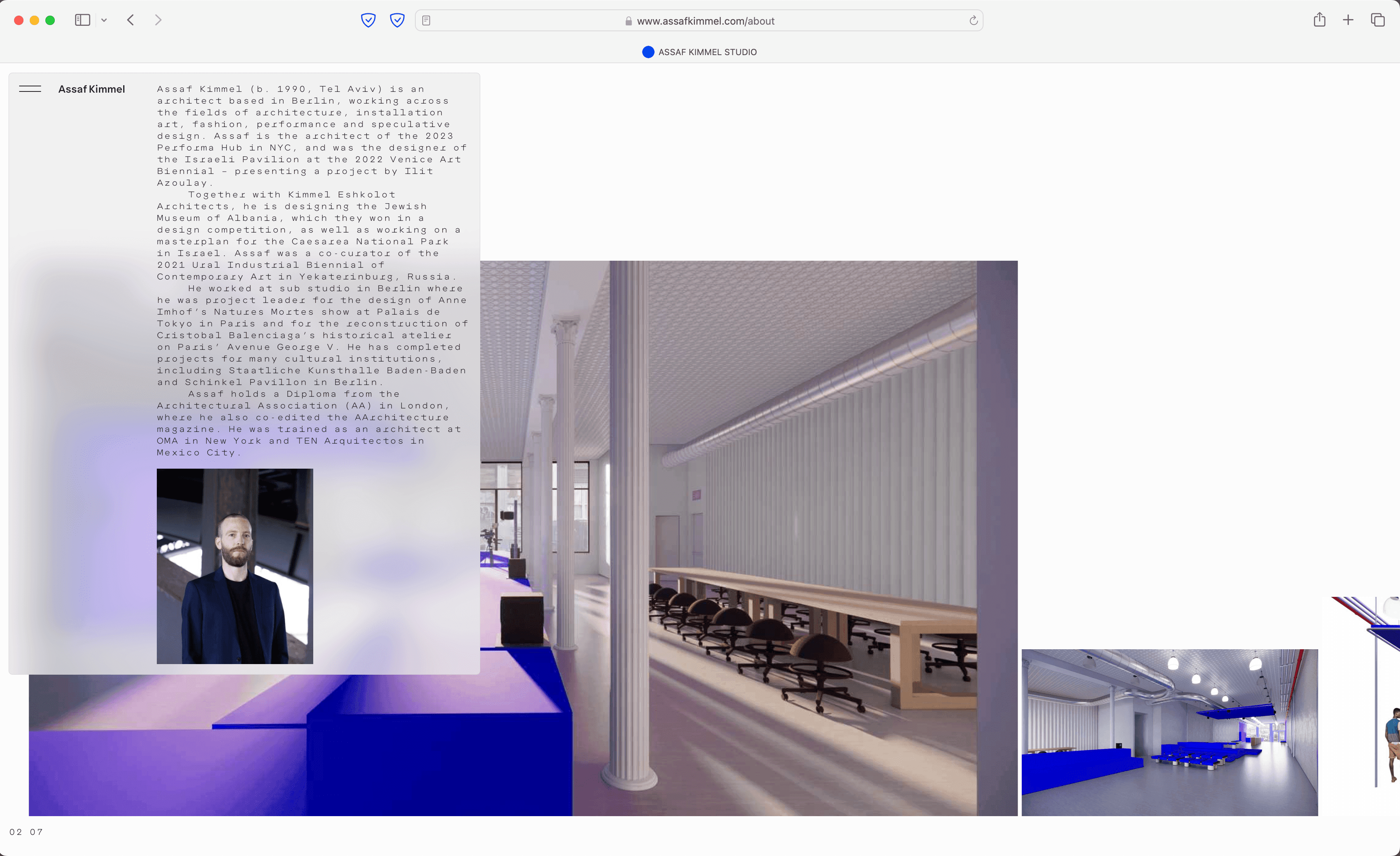
Assaf Kimmel Studio
Web Design, Programming
Assaf Kimmel is a Berlin-based architect working across various fields, including architecture, installation art, fashion, performance, and speculative design. His work explores the intersections of these disciplines, aiming to create projects that blend functionality with experimentation. The concept for his website reflects this approach, incorporating a dynamic widget designed to centralize and simplify navigation. The widget functions as an all-in-one tool, serving as the menu, main navigation, archive, and primary information layer. It allows users to access key content in an efficient and straightforward manner. Beneath the widget, project images are displayed in a custom slider that adapts dynamically, adding visual depth and organization to the site. The website’s layered design emphasizes clarity while supporting a broad range of content, mirroring the multidisciplinary nature of Kimmel’s work. By combining interactivity and functionality, the site offers a user-friendly way to explore his projects and ideas.
Oct 2024
Project coordination by MatterOf Visual Practices. Design concept and programming by Mark Julien Hahn.
2 / 6
3 / 6
4 / 6
5 / 6
6 / 6
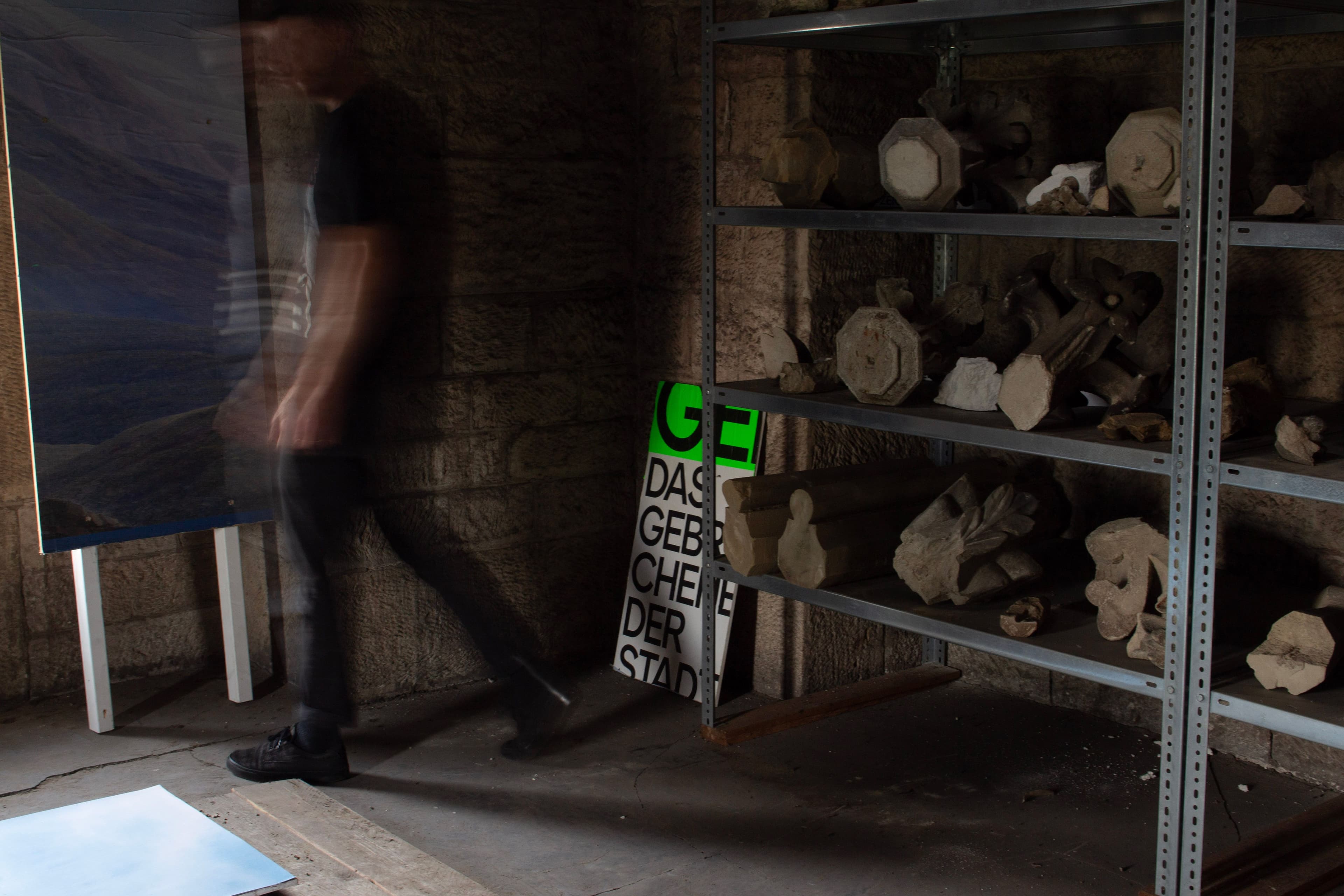
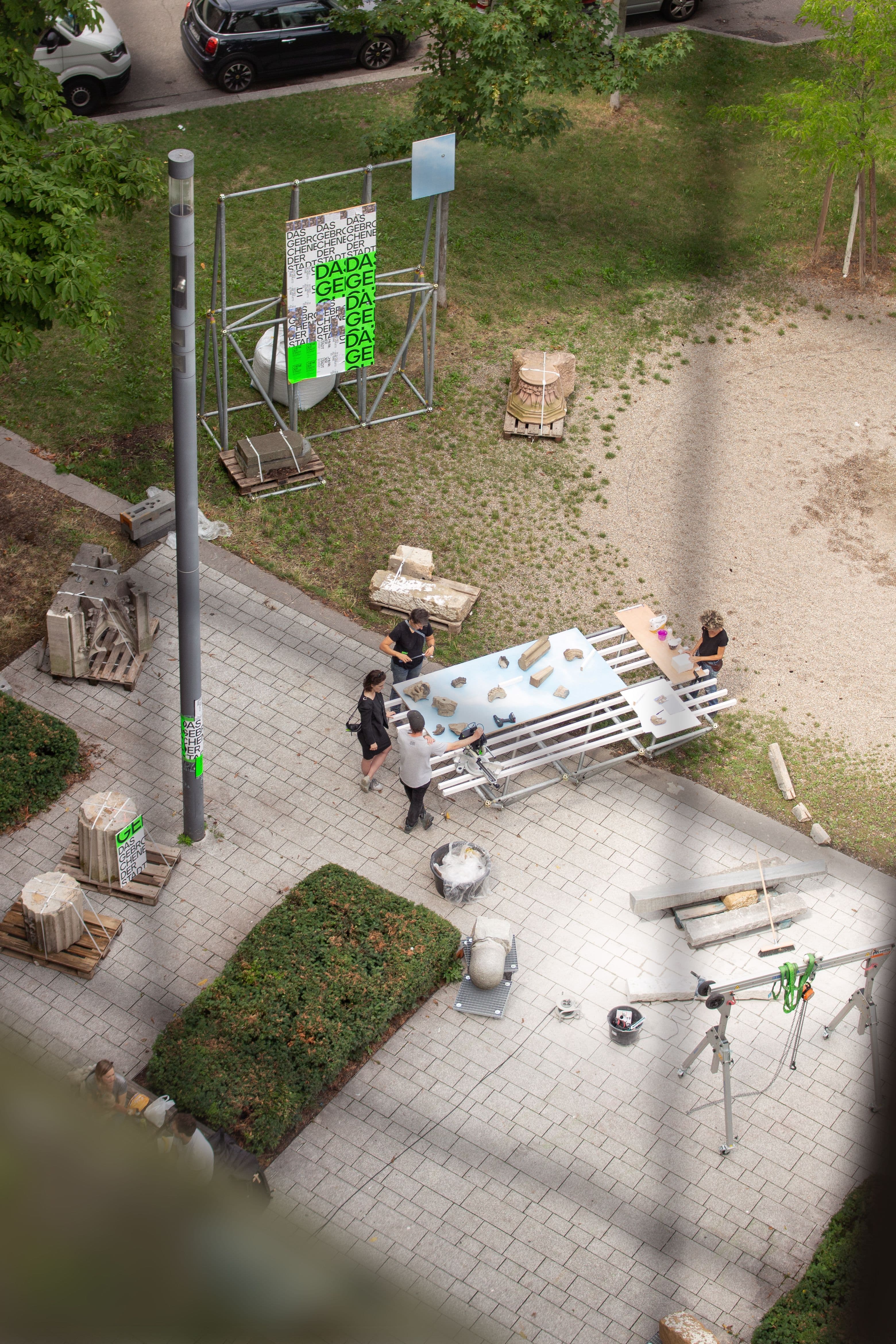
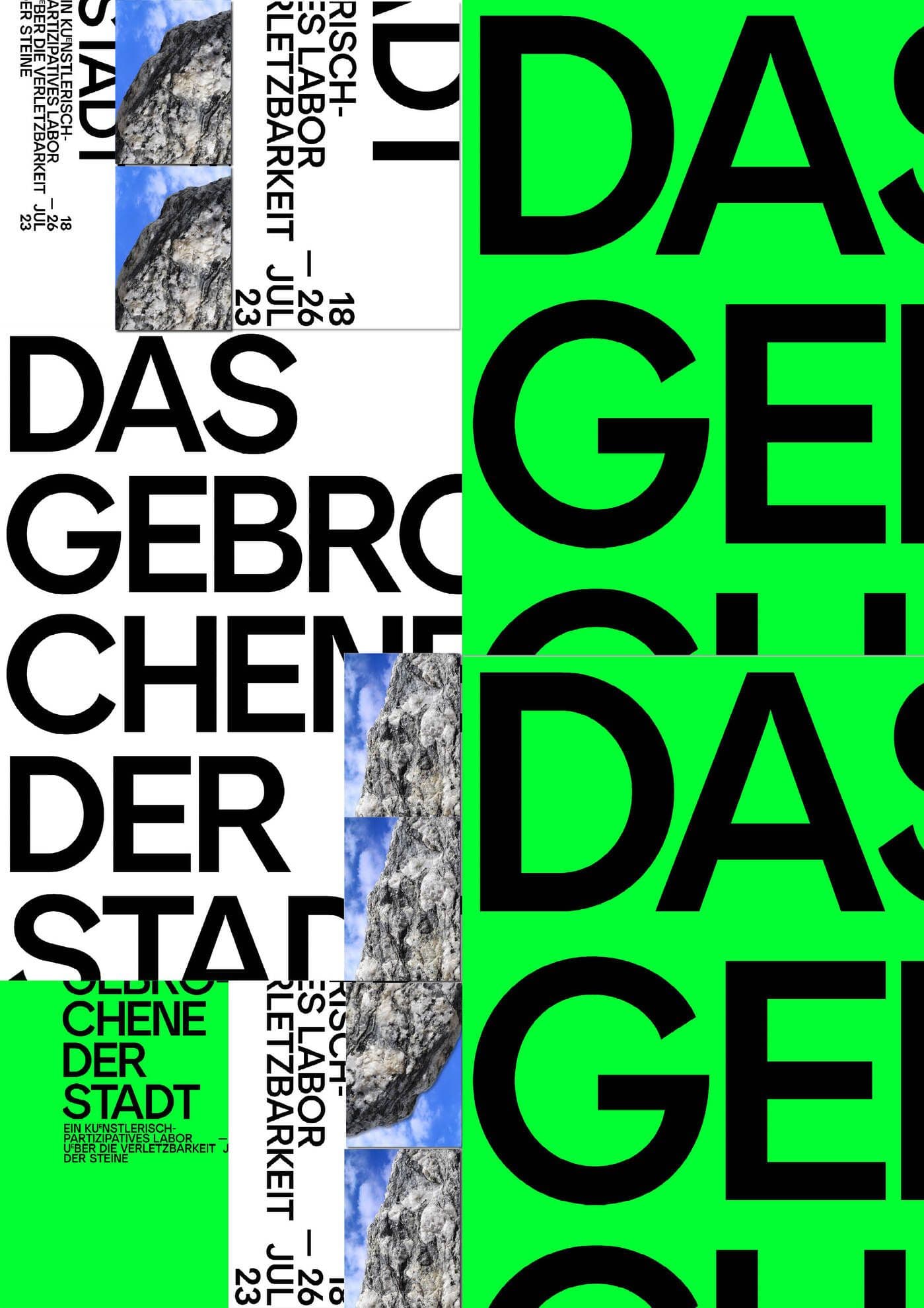
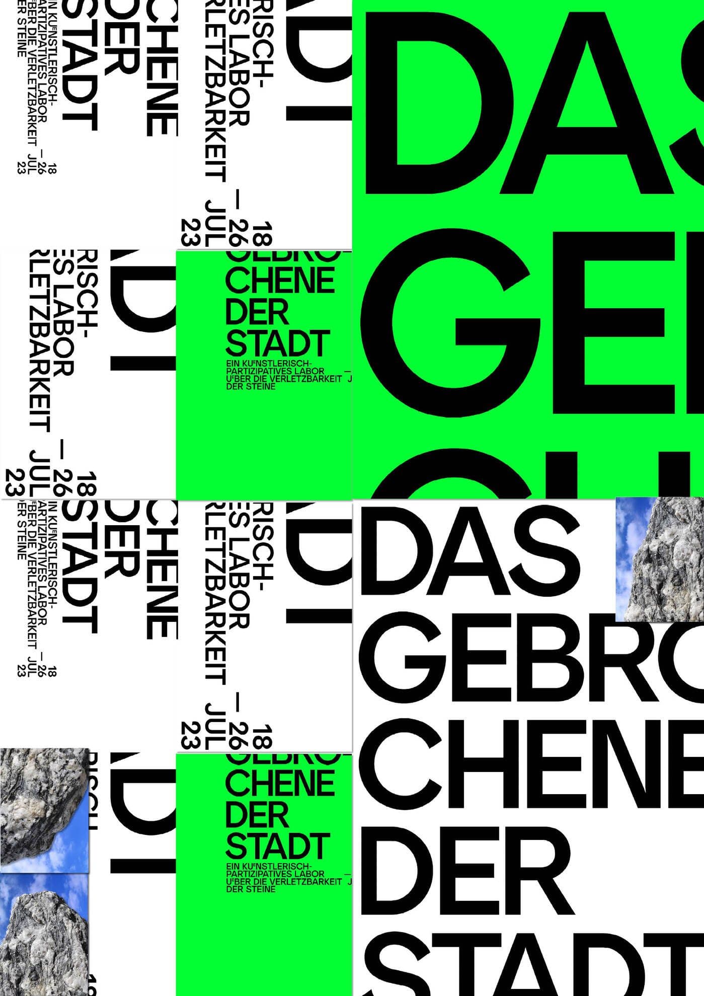
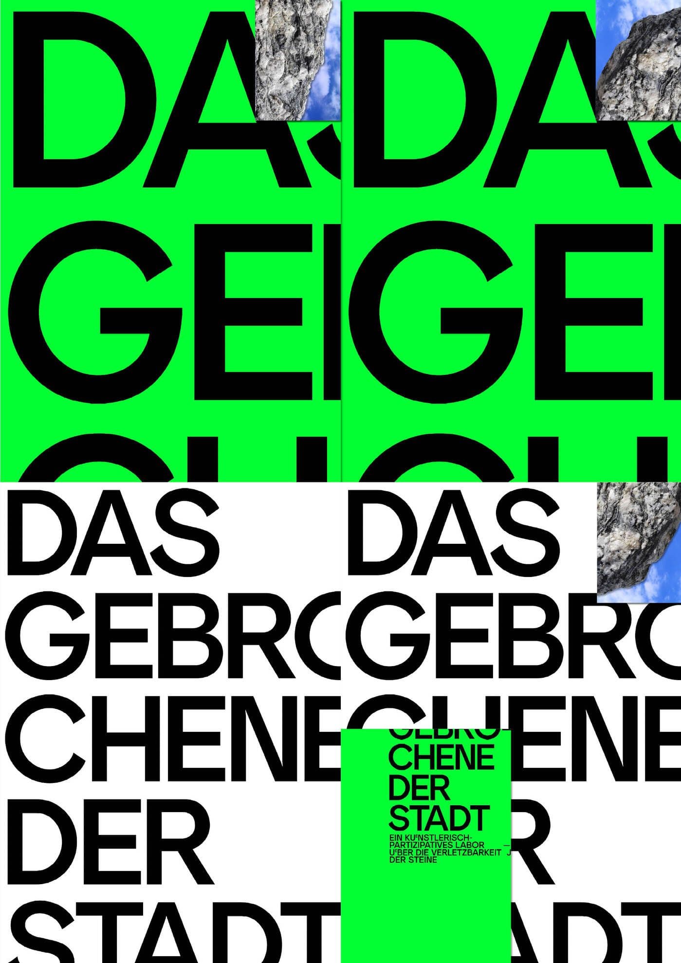
Das Gebrochene der Stadt
Poster
The visual identity for Das Gebrochene der Stadt is bold and reductive, reflecting the project’s focus on fragments and provisional forms. Neon green and white define the palette, creating high-impact visuals that demand attention and evoke the intensity of urban materiality. Posters are treated as fragmented compositions, with clean, angular shapes that reference the broken and the incomplete. Photographic stone textures are integrated as striking visual elements, anchoring the design in the material focus of the project The identity’s simplicity and sharp contrasts mirror the project’s raw and unpolished ethos, presenting a visual language that feels immediate, grounded, and unapologetically direct.
Jul 2023
The project, conceived and directed by Sebastian Klawiter and Fanti Baum, was realized through an open workshop held from July 19 to July 30, 2023 at Ruppert-Mayer-Platz, Berlin.
1 / 5
2 / 5
3 / 5
4 / 5
5 / 5
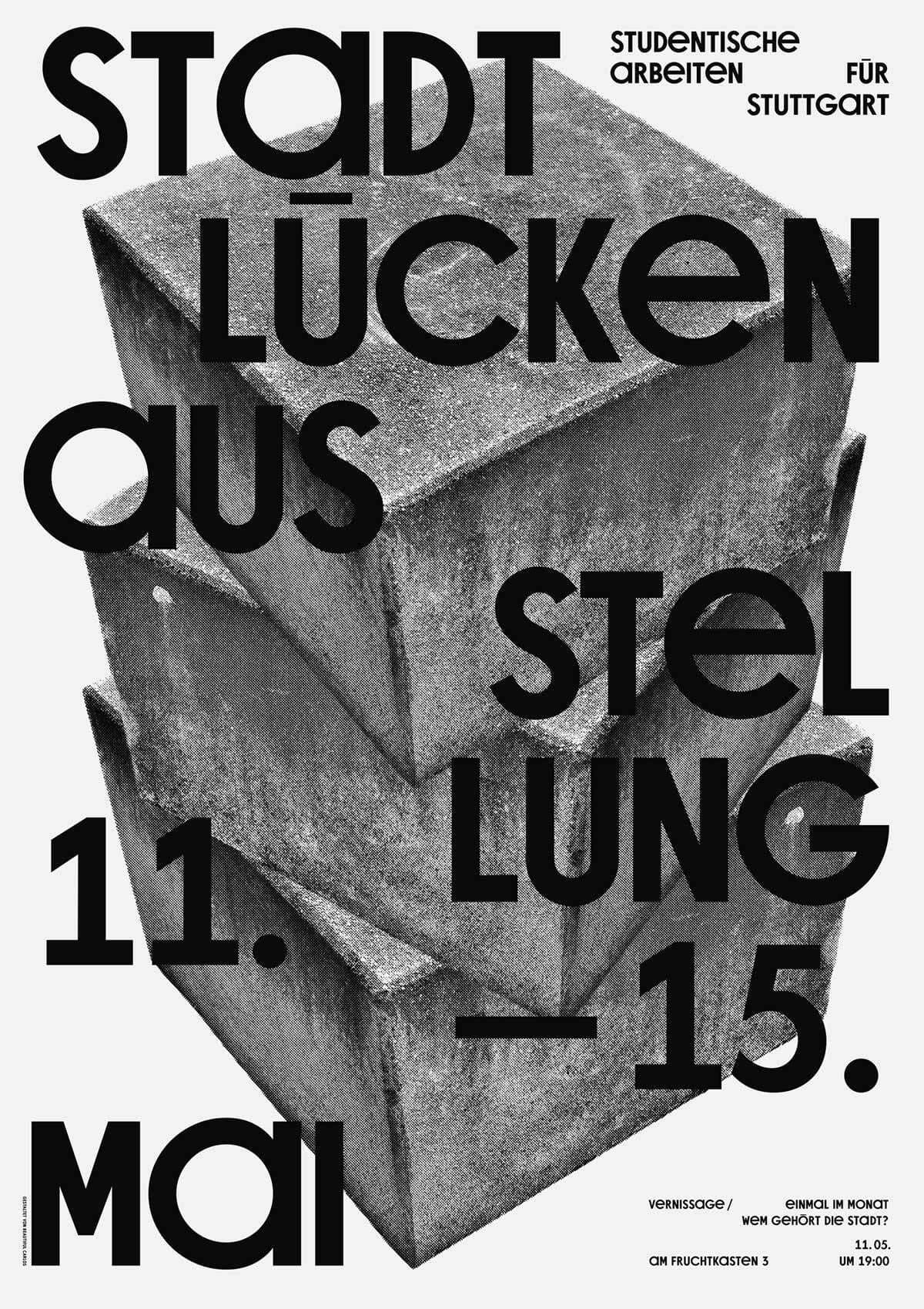
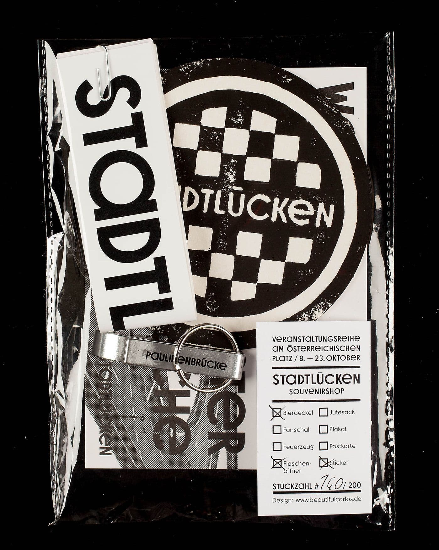
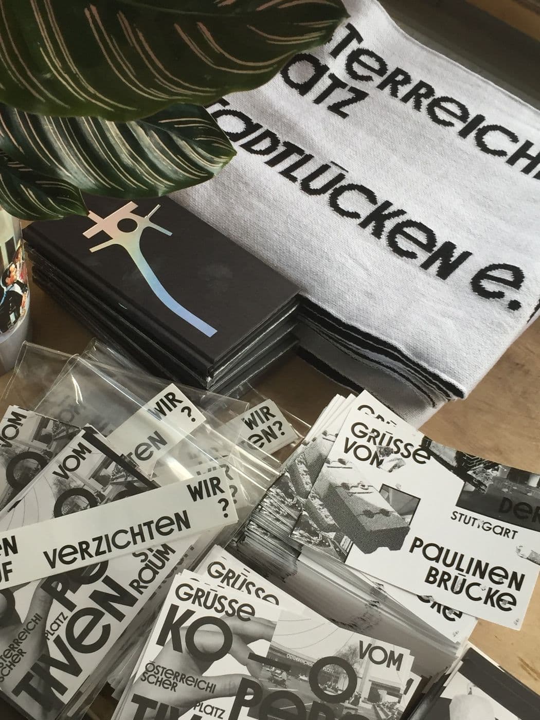
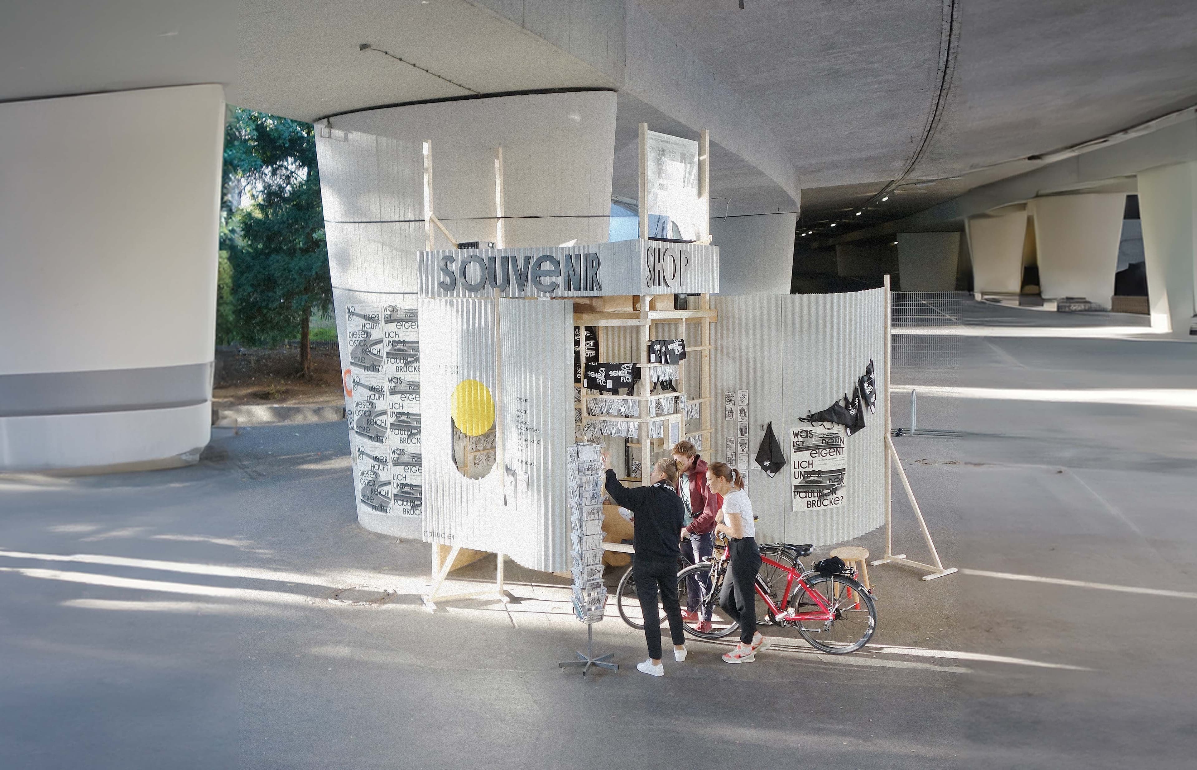
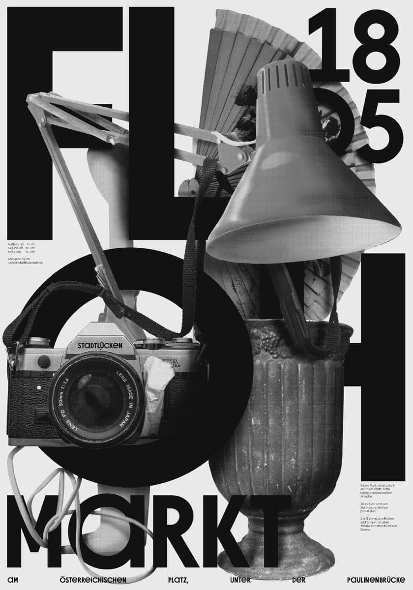
Stadtllücken
Type Design, Identity
Stadtlücken is a nonprofit organization founded by designers to emphasize the importance of public space as a cornerstone of democratic coexistence. It identifies gaps—whether physical, social, or legal—as opportunities for creative intervention and the reclamation of spaces for the common good. Through cooperative urban design, Stadtlücken brings overlooked places into focus, unlocks unused spaces, and drives projects that make cities more inclusive and livable. Based in Stuttgart and active far beyond, the organization shares its expertise widely and fosters collaborations to rethink urban potential. Central to its identity is a custom-designed typeface, serving as a distinct visual representation of its mission and values.
Sep 2017— ongoing
The concept was developed collaboratively by the entire group of Stadtlücken, reflecting its nature as a dynamic and ever-evolving social construct.
1 / 5
2 / 5
3 / 5
4 / 5
5 / 5
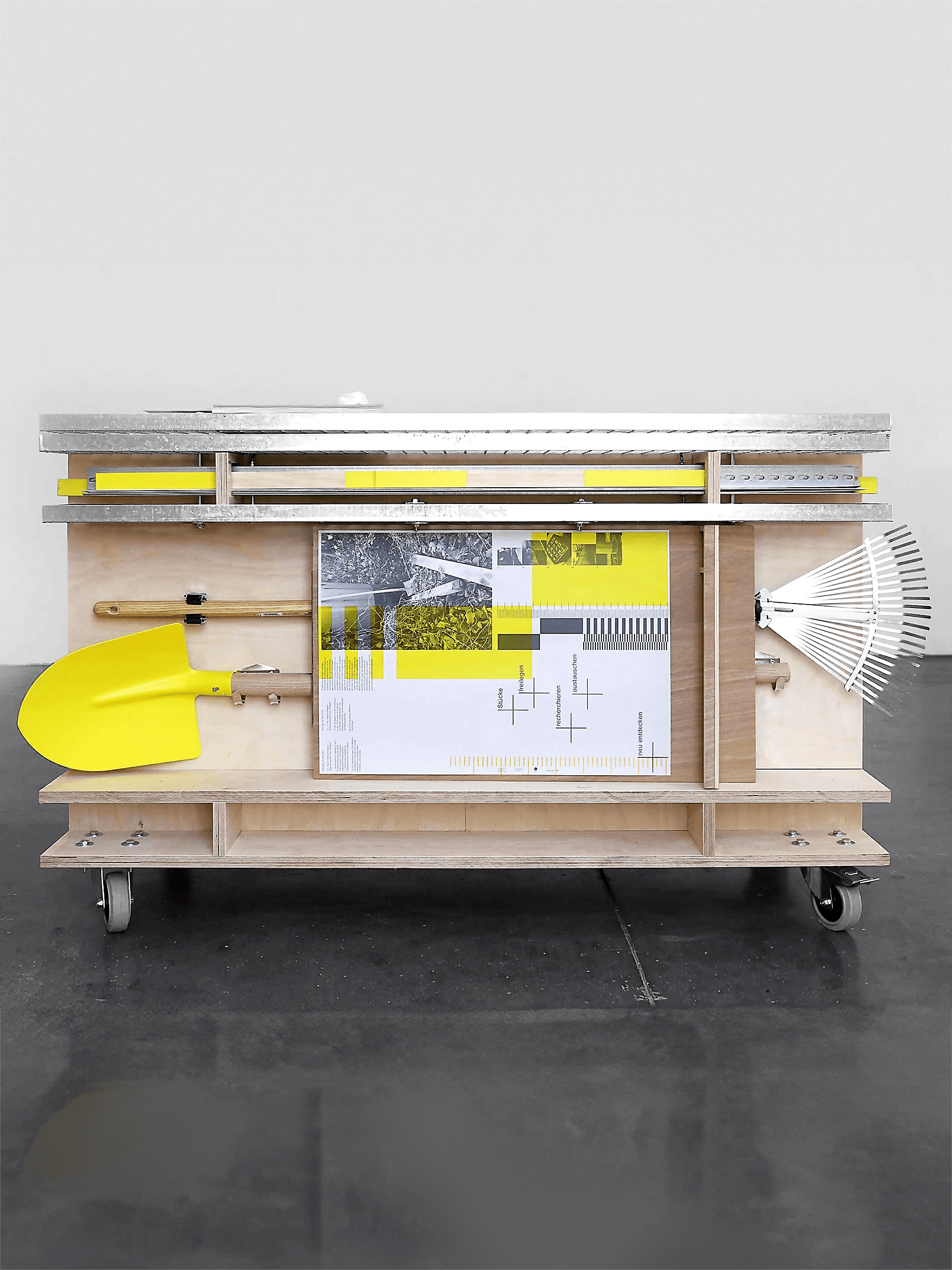
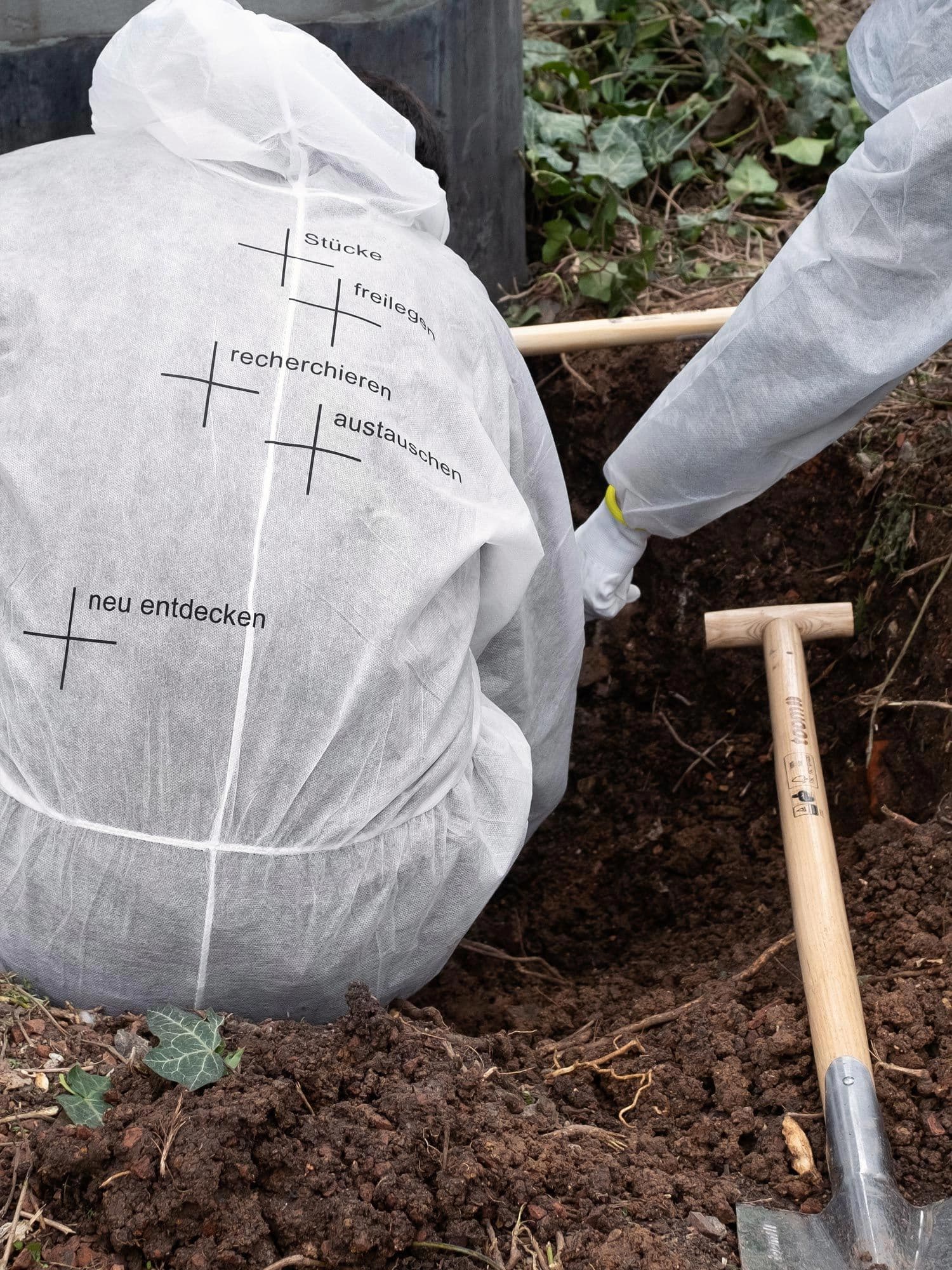
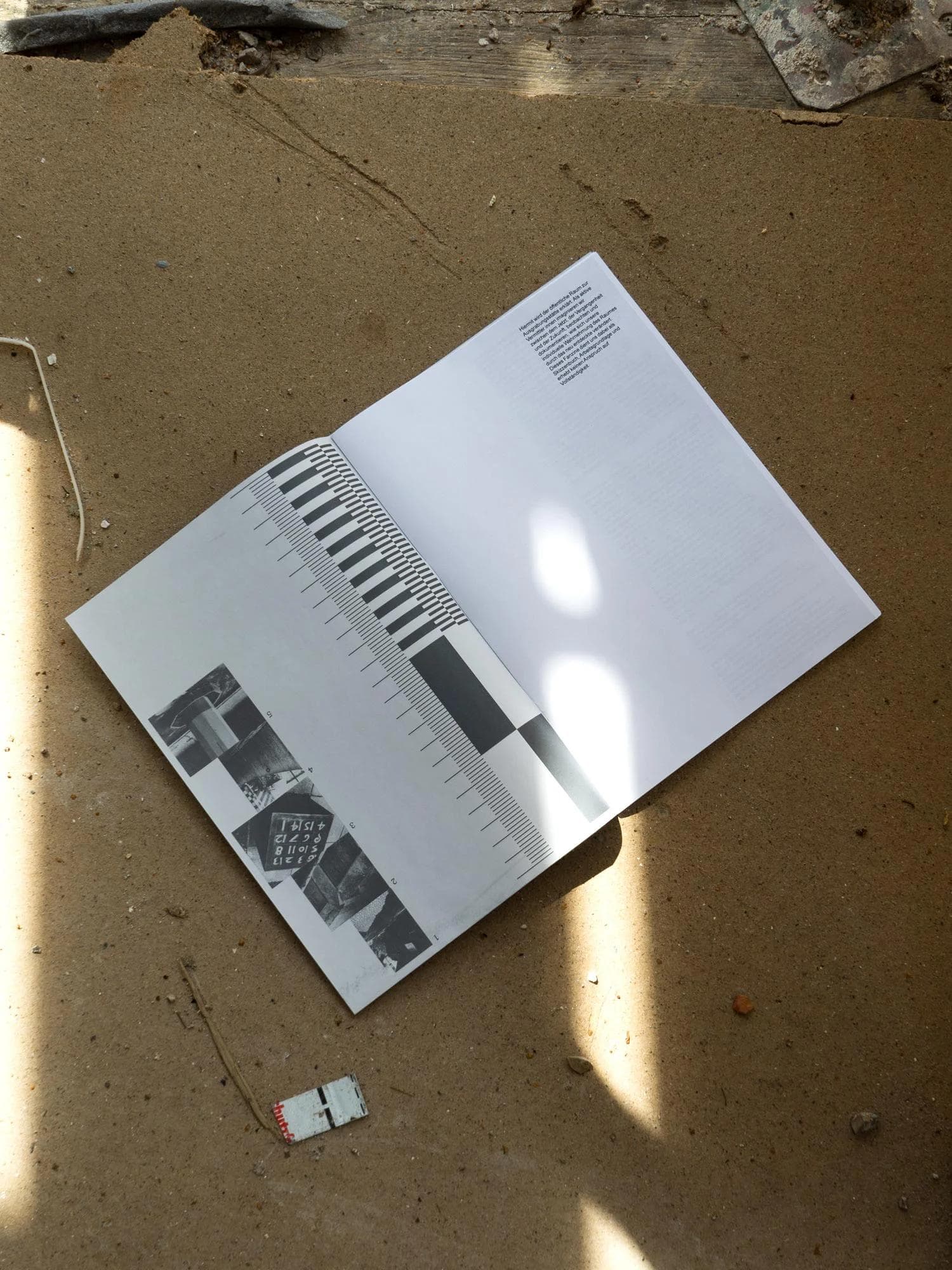
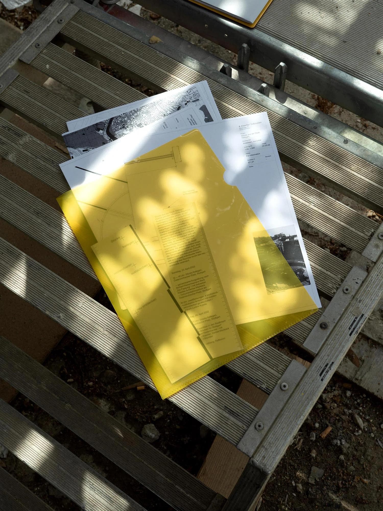
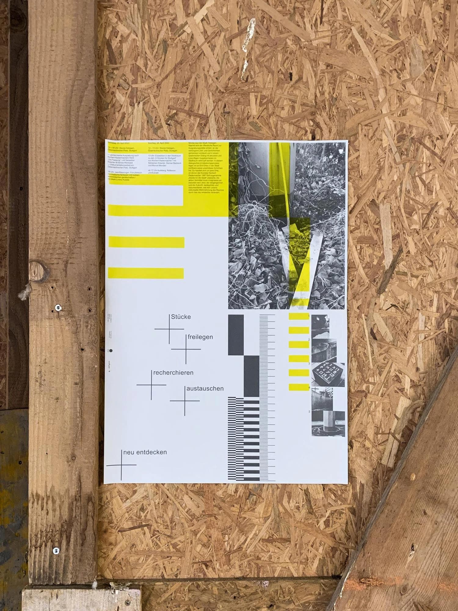
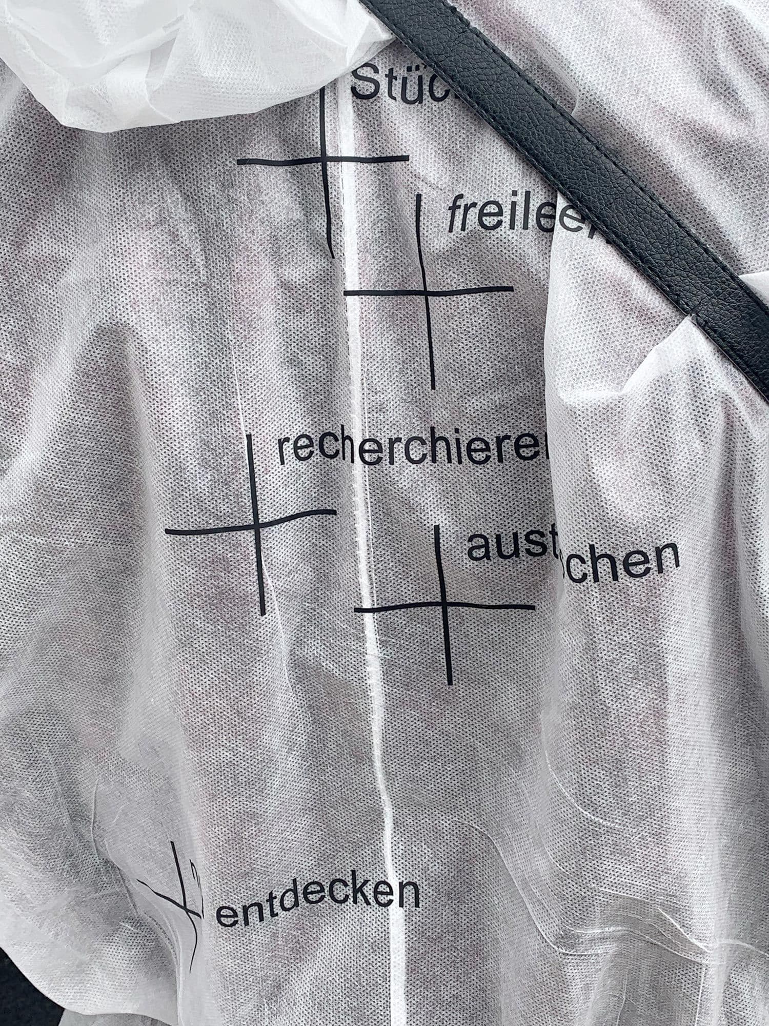
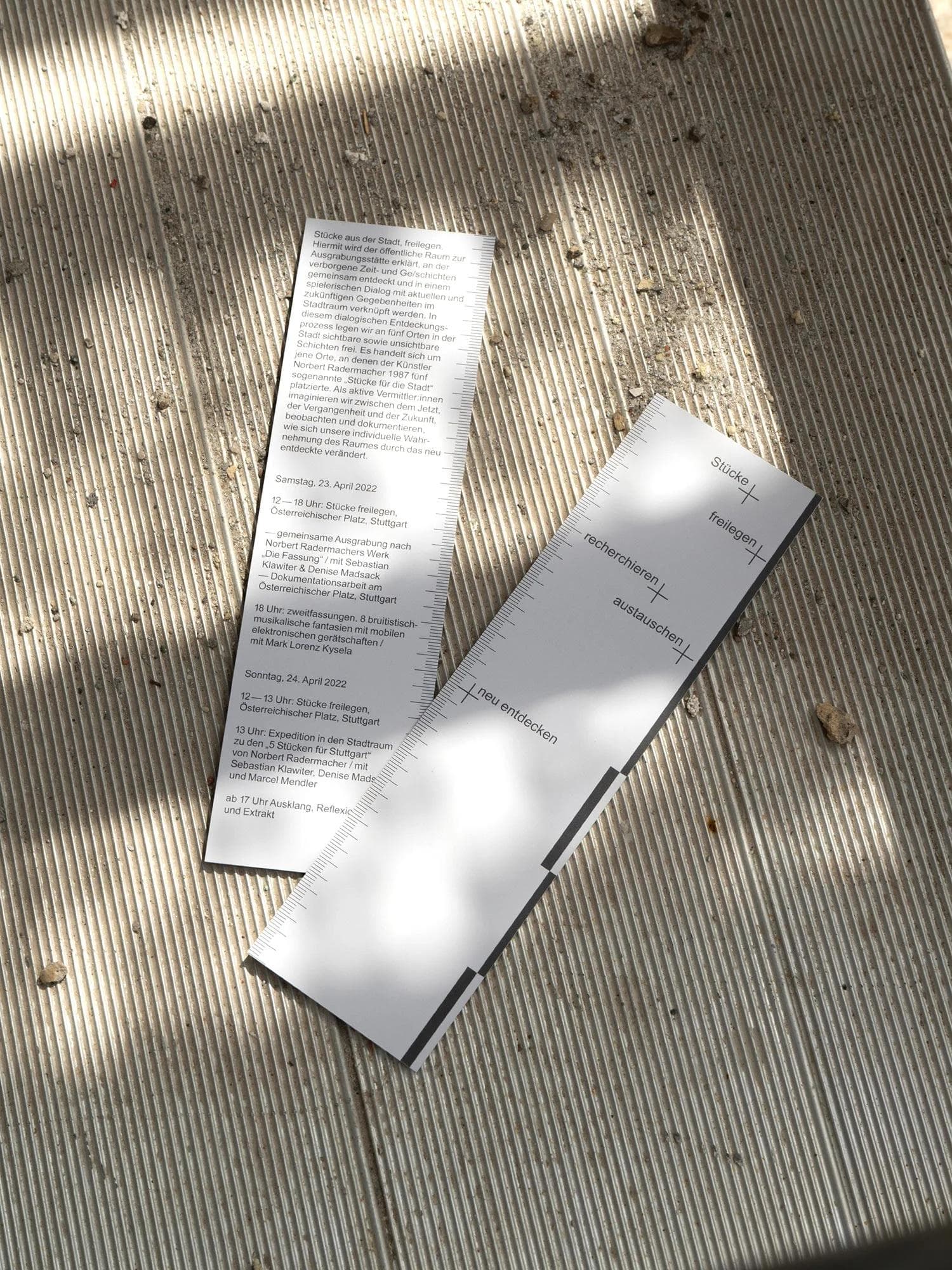
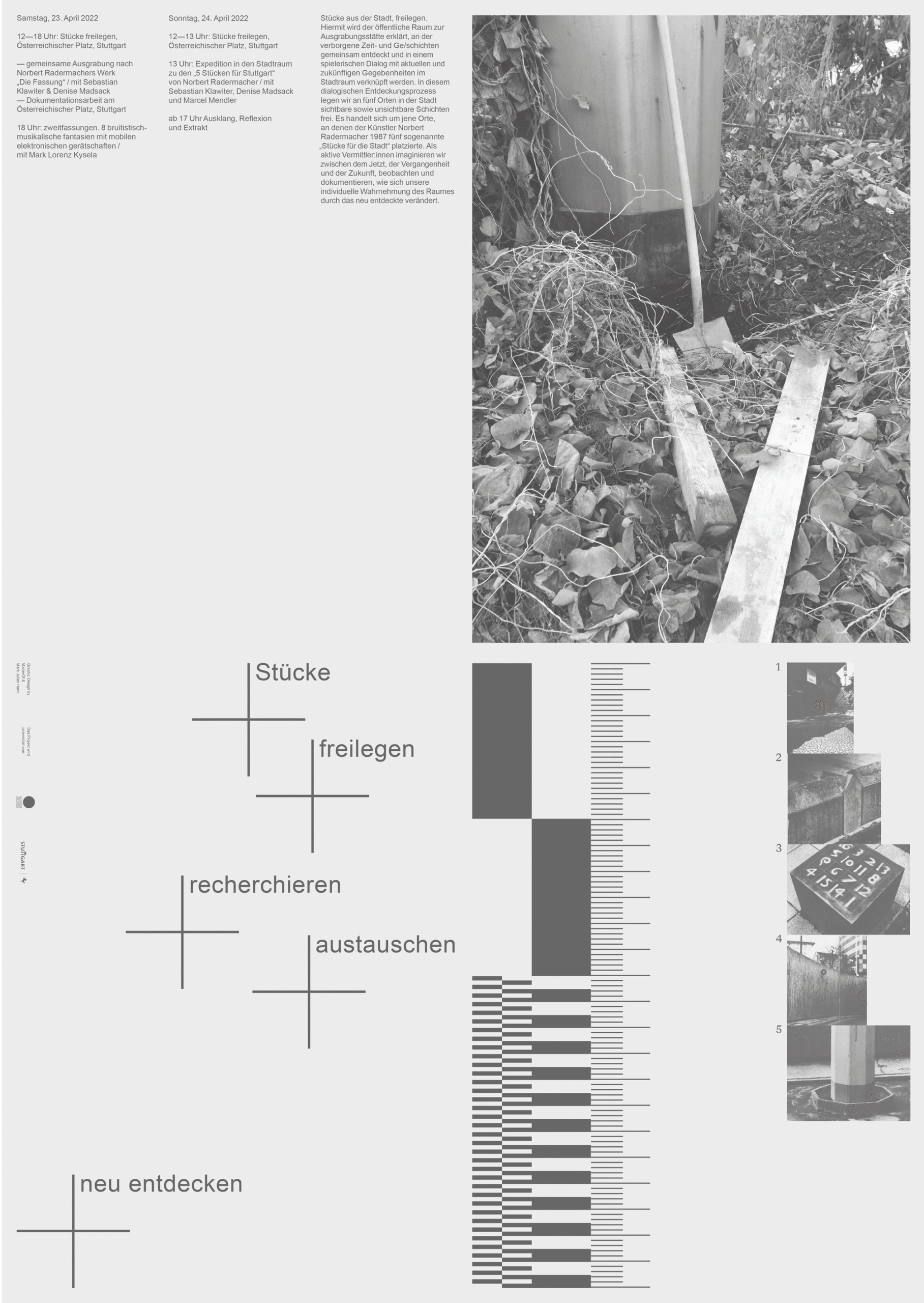
Stücke Freilegen
Identity
Identity design for Stücke freilegen, an archeological performance event by Sebastian Klawiter and Denise Madsack. The project focused on five public spaces designated as excavation sites, where artist Norbert Radermacher had installed “pieces for the city” in 1987. These artworks, along with the layers of time and stories embedded within them, were rediscovered and reconnected to their urban surroundings. The design concept draws inspiration from traditional archeological tools and measurement aesthetics. In collaboration with the artists, we developed a comprehensive urban archeology toolkit, featuring a mobile action cart designed for hands-on urban excavation events.
May 2021
Performance and concept by Sebastian Klawiter and Denise Madsack. Design in cooparation with MatterOf Visual Practice.
1 / 8
2 / 8
3 / 8
4 / 8
5 / 8
6 / 8
7 / 8
8 / 8
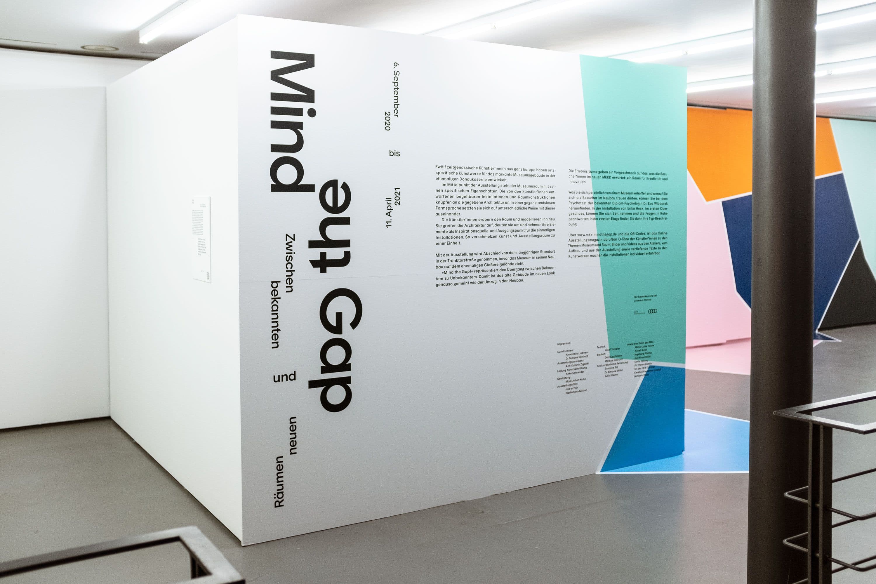
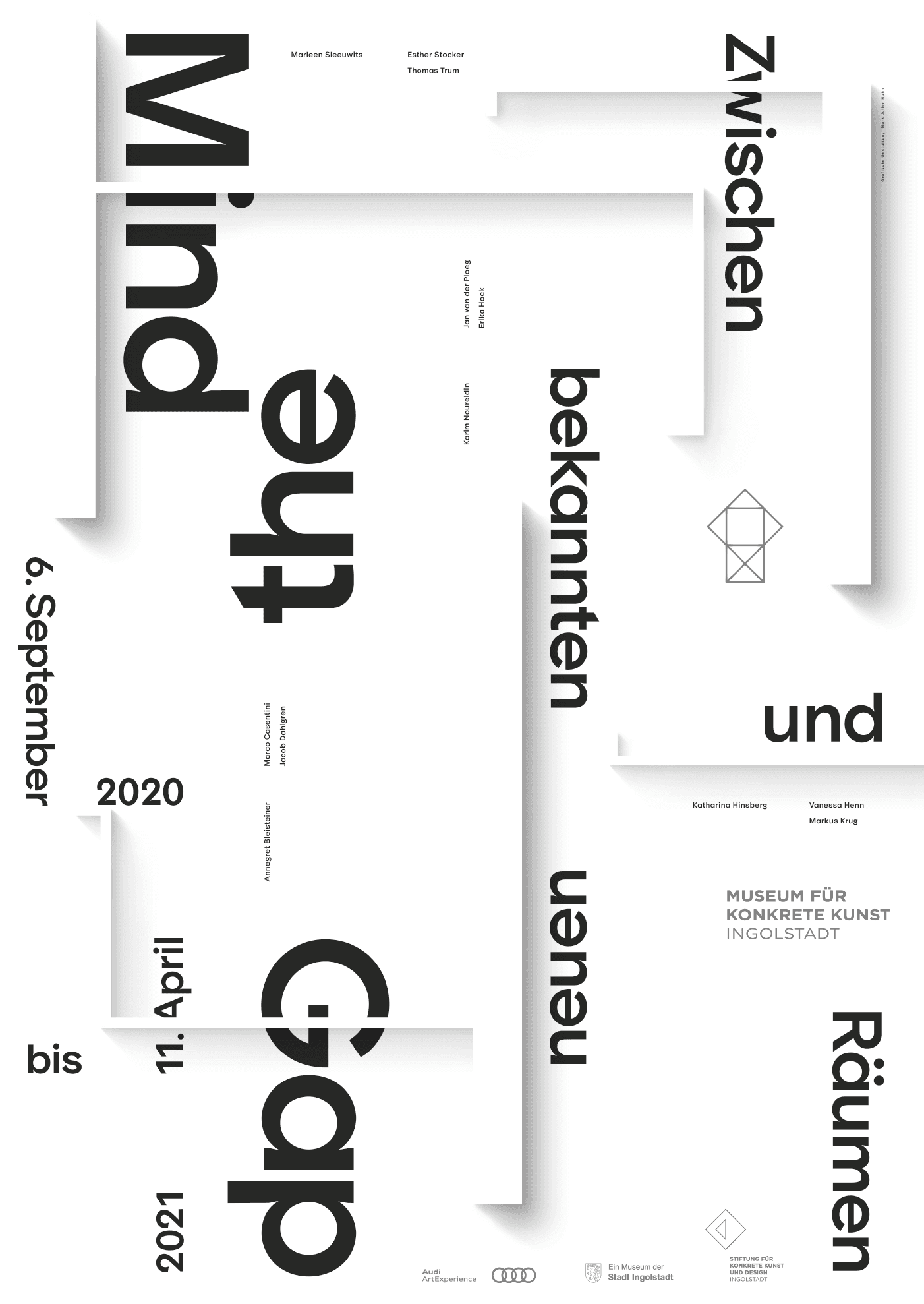
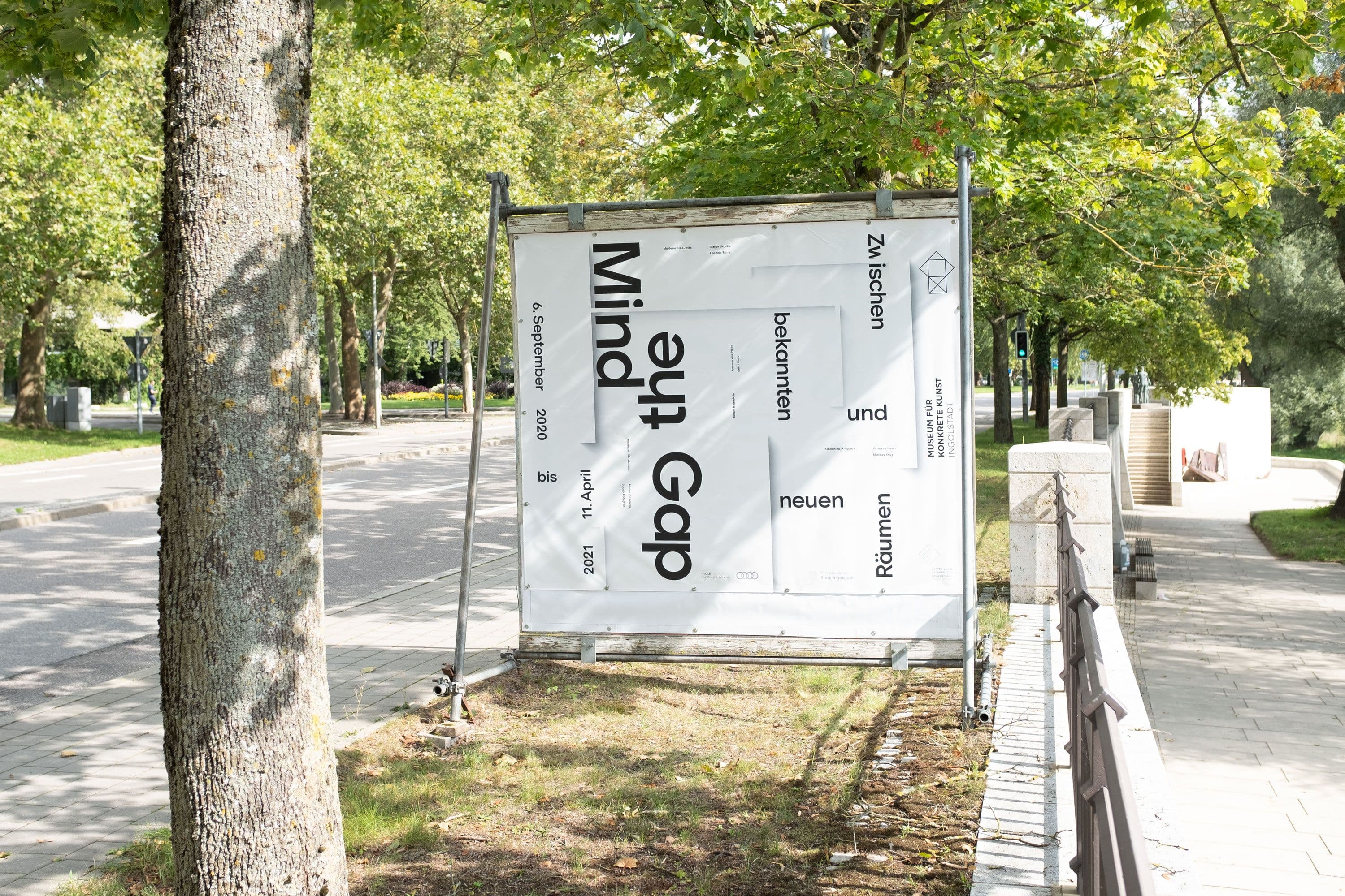
Mind the Gap
Exhibition, Identity, Poster
The exhibition Mind the Gap, held at the Ingolstadt Museum of Concrete Art and Design from September 2020 to June 2021, marked a pivotal moment in the institution’s history. As the final exhibition in the museum’s old building before its relocation to a newly constructed space later that year, the project explored themes of transition and transformation. The title itself, Mind the Gap, underscored the tension between the past and future, inviting reflection on the liminal space between departure and arrival. At the core of the exhibition’s identity was an exploration of space as both a physical and conceptual subject. The design subtly engaged with the architecture of absence and possibility, employing shadows and negative space to suggest forms yet to emerge. This understated approach mirrored the exhibition’s themes, highlighting the potential of emptiness and the ways in which space can frame new beginnings. Through its restrained yet evocative visual language, the identity became an integral part of the dialogue on transition, echoing the museum’s shift from its historical foundation to a fresh chapter.
Sep 2020
The exhibition took place at the Museum für Konkrete Kunst Ingolstadt from September 2020 to July 2021.
1 / 3
2 / 3
3 / 3